04 ਅਗ 2025·8 ਮਿੰਟ
ਵਪਾਰਕ ਐਪ ਲਈ ਦੁਬਾਰਾ ਵਰਤੇ ਜਾਣ ਵਾਲੇ ਸਕਰੀਨ: 12-ਸਕਰੀਨ ਬਲੂਪ੍ਰਿੰਟ
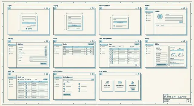
ਵਪਾਰਕ ਐਪਾਂ ਲਈ ਦੁਬਾਰਾ ਵਰਤੋਂਯੋਗ ਸਕਰੀਨਾਂ ਦਾ ਪ੍ਰਯੋਗਿਕ 12-ਸਕਰੀਨ ਬਲੂਪ੍ਰਿੰਟ — auth, roles, ਸੈਟਿੰਗਸ, ਬਿਲਿੰਗ, ਆਡਿਟ/ਸਹਾਇਤਾ ਅਤੇ ਗਲਤੀਆਂ ਨੂੰ ਕਵਰ ਕਰਦਾ।
ਵਪਾਰਕ ਐਪਾਂ ਲਈ ਦੁਬਾਰਾ ਵਰਤੋਂਯੋਗ ਸਕਰੀਨਾਂ ਦਾ ਪ੍ਰਯੋਗਿਕ 12-ਸਕਰੀਨ ਬਲੂਪ੍ਰਿੰਟ — auth, roles, ਸੈਟਿੰਗਸ, ਬਿਲਿੰਗ, ਆਡਿਟ/ਸਹਾਇਤਾ ਅਤੇ ਗਲਤੀਆਂ ਨੂੰ ਕਵਰ ਕਰਦਾ।
Start with a reusable screen blueprint because most delays come from rebuilding the same “boring” pages (auth, settings, billing, roles) in slightly different ways. A shared default keeps behaviors consistent and reduces QA time, edge cases, and user confusion.
A component is a small UI piece like a button or table. A reusable screen is a full page with a clear job, predictable layout, and standardized states like loading, empty, and error, so users don’t have to relearn the basics across your app.
A practical MVP set is Log in, Sign up, Password reset, Onboarding, Profile, and Settings. Add Team members and Roles if the app is multi-user, Billing if you charge, and Usage if you enforce limits.
Keep login simple: email/username, password, and one clear action. Add a show-password toggle and clear error messages, and avoid extra options unless you truly support them well.
Use a neutral message that doesn’t confirm whether an email exists, like “If an account matches that email, we sent a reset link.” Keep the flow short: request, email link, set new password, success confirmation.
Ask only what’s required to start using the app, and make optional steps easy to skip. Separate “start working” from “make it perfect” so users can do real work quickly and fill in details later.
Start with a small, familiar set (Owner, Admin, Member, Viewer) and explain each role in plain language. Use a readable permissions matrix and keep critical actions like billing and ownership transfer restricted to Owners.
Treat it like an inbox: clear status badges (Invited, Active, Suspended), fast actions (resend invite, change role, remove user), and helpful context like “last active.” When blocking an action, say why and who can do it instead.
Use a stable settings hub with a left-side category menu and a right-side details panel. Keep categories obvious (Profile, Notifications, Security, Organization) and avoid scattering important items across random pages.
Show plan, renewal date, payment method status, invoices, and billing email in a simple overview. Make limits explicit and explain what happens when a limit is hit, then pair that with a usage screen that warns before users get blocked.