Aug 20, 2025·8 min
Progressive disclosure for admin tools: safer operator UIs
Learn progressive disclosure for admin tools to keep powerful controls usable for operators, reduce accidental changes, and cut support load with simple UI patterns.
Learn progressive disclosure for admin tools to keep powerful controls usable for operators, reduce accidental changes, and cut support load with simple UI patterns.
Admin tools often mix “normal work” and “dangerous work” on the same screen. An operator might update a phone number, reset a password, change a billing plan, disable an account, and permanently delete a record, all in one place. When every control looks equally important, people treat it all as equally safe.
Admin screens also grow without a plan. Each new feature adds another toggle, button, or dropdown. Over time you get a wall of controls with no clear hierarchy. Operators scan fast, click fast, and lean on muscle memory. That’s when misclicks happen.
Small UI choices turn into support tickets. If “Save” and “Delete” share the same visual style, someone will eventually hit the wrong one. If permissions are buried inside a long form with little explanation, someone will grant too much access “just to make it work,” then forget to roll it back.
Accidental damage in admin tools tends to fall into a few predictable buckets: data gets deleted or overwritten with no easy way back, permissions change for the wrong person or group, a production setting flips and breaks a workflow, a bulk action hits more items than intended, or a “test” change leaks into real customer data.
These mistakes rarely come from careless people. They come from screens that don’t separate common, low-risk tasks from rare, high-risk controls. When risky actions are always visible, always enabled, and one click away, the UI trains users to fear the tool or to avoid it until something is urgent.
Progressive disclosure helps because it keeps power features available without letting them dominate the everyday experience. A good admin UI makes the safe path the easiest path, and makes the dangerous path deliberate.
If you build admin tools with a chat-to-app platform like Koder.ai, it’s still worth reviewing the generated screens with this lens. Speed helps, but operator safety comes from clear structure, not from packing more controls onto one page.
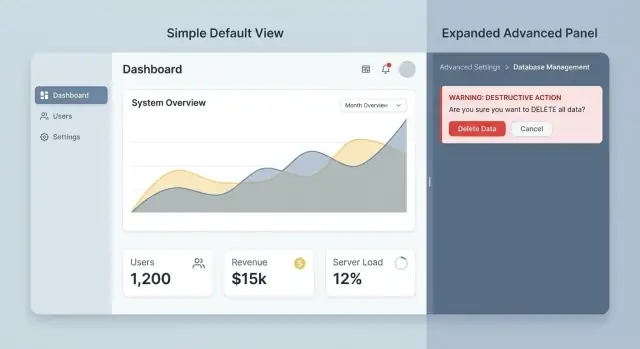
Progressive disclosure in admin tools means showing the safest, most common controls first, then revealing more powerful or risky options only when the operator clearly needs them.
The default view should match day-to-day work: quick lookups, routine updates, and clear status. Advanced settings still exist, but they appear after a deliberate step like opening an “Advanced” panel, switching into an “Edit” mode, or moving into a separate flow that requires confirmation.
A simple way to decide what belongs where is to sort controls by frequency and risk. The default view should cover what people do often and what can’t cause serious damage. Disclosed views should hold infrequent actions, edge cases, and anything that can lock users out, delete data, or change system behavior.
A few placement rules usually hold up:
This isn’t about hiding features. It’s about timing and focus. Operators shouldn’t have to scan past dangerous controls to do routine work, and new team members shouldn’t be one misclick away from a ticket.
Example: on a user profile screen, the default view might show name, email, role, and a simple “Reset password” action. A separate “Advanced” area could include “Revoke all sessions” or “Delete user” with extra friction. If you build internal admin tools with Koder.ai, you can apply the same idea by starting with a safe basic screen, then adding advanced panels and confirmations once the workflows are clear.
Progressive disclosure works best when it matches how people actually operate the system. Before you group or hide anything, get clear on who uses the admin tool, what they do every day, and what can cause real harm if clicked at the wrong time.
Most admin tools end up serving a small set of repeat roles. Name them in plain words, then write down their top tasks (not their permissions, and not a list of features).
A common breakdown looks like this:
Once roles are clear, decide what each role should see by default. A good rule is simple: if a control isn’t part of someone’s weekly job, it shouldn’t be on their main screen. It can still exist, but it should sit behind an “Advanced” area, a separate tab, or a permission gate.
For example, an agent might need “Reset user password” daily, but doesn’t need “Disable SSO for the whole workspace” on the same page. Putting both side by side invites accidental damage, even if the UI includes warnings.
Classify actions by how hard they are to undo, not by how scary they sound:
Use this rating to decide what stays fast and visible versus what requires extra intent. Low-risk actions can be quick. High-risk actions should be deliberate, clearly worded, and limited to the right roles.
Support cases are a shortcut to the truth. Review recent tickets that begin with “I clicked” or “We didn’t mean to.” Those stories usually point to the real risk zones: confusing toggles, bulk actions that look harmless, or settings that affect everyone when the operator thought they were changing one user.
Good admin screens feel calm, even when they control risky things. The trick is to reveal power only when the operator signals intent.
A progressive form is a reliable pattern. Start with a simple choice, then reveal the next fields only when they matter. If an operator chooses “Suspend user,” show duration and notification options. If they choose “Reset password,” those fields never appear, so there’s less to misread.
Collapsible advanced sections work well too, as long as they’re labeled in plain language. The label should say what’s inside and why someone would open it, like “Advanced: SSO and token settings (admins only).” If it sounds a little scary, that’s fine. It sets expectations.
For settings that are rarely touched, move them to a secondary screen or a modal so they don’t sit next to everyday controls. This is especially useful for anything that can break integrations, change billing, or delete data.
When technical details are needed, show them only on demand. A “Show details” toggle for IDs, raw payloads, and long logs keeps the main UI readable while still supporting troubleshooting.
If you want a short starter set, these patterns tend to work across most admin tools:
Defaults should protect the system without making operators feel punished. If the safest option is also the most common, preselect it and explain it in one sentence. For example, default a permission change to “View only” and require a second step to grant “Manage.”
If you’re building an admin tool in Koder.ai, these patterns map cleanly to common UI pieces you can generate quickly (forms, collapsible panels, modals). The key is still the same: design the calm default view first, then add power where it’s earned by intent.
Pick one screen that regularly creates “oops” moments. Choose something operators visit many times a day, where a wrong click leads to tickets, refunds, or downtime. Don’t start with the hardest screen in the system. Start where a small change will cut support load quickly.
Inventory every control on the screen and label it in two ways: how often it’s used (common vs occasional) and what happens if it’s used wrong (low vs high risk). That map tells you what must stay visible and what should be tucked behind a deliberate action.
Then sketch a new default view that contains only the “common + low-risk” set. Keep it predictable. If an operator’s job is usually to update statuses, add notes, and resend emails, those belong in the main layout. Bulk operations, rare settings, and anything irreversible shouldn’t compete for attention.
A few practical disclosure moves:
Finish by testing with two or three realistic tasks that match how operators work. Example: “Change a customer’s plan, refund the last invoice, and keep access active.” Watch for hesitation, misclicks, and backtracking. If you’re iterating in Koder.ai, this is also a good time to use snapshots and rollback so you can ship the new screen safely and revert quickly if needed.
If the redesign reduces time-to-complete without increasing anxiety, you’ve disclosed the right things at the right time.
Destructive actions are part of admin work, but they should never be one misclick away. The goal is straightforward: keep day-to-day controls fast, and make high-risk actions slower and clearer.
Start by making destructive actions look and feel different. Place them away from common buttons like Save, Update, or Invite. Use a distinct danger style, extra spacing, and a separate section (often at the bottom) so operators don’t hit them while moving quickly. Physical separation reduces muscle-memory mistakes.
Labels matter more than people think. Avoid vague buttons like “Confirm” or “Yes.” The button should say exactly what will happen, such as “Delete user” or “Reset API key.” Clear verbs let operators self-check before acting.
For truly irreversible changes, require explicit intent. A modal with a checkbox usually isn’t enough. Use typed confirmation with a specific phrase and include the target name to prevent “wrong tab” errors. For example: type DELETE to remove Acme Team.
Before applying the change, show a short preflight summary of what will change. Keep it scannable:
Whenever possible, offer safer alternatives. Many “deletes” are really “I want this out of my way.” Provide options like disable, archive, or suspend, and explain the difference in one sentence. Suspending a user blocks login but keeps history and billing records. Deleting removes the account and may remove related data.
A practical rule: if the operator might regret it tomorrow, the default should be reversible. Keep hard-delete behind a second step, a separate permission, or both.
Progressive disclosure isn’t only about hiding advanced settings. It also means making outcomes clear after changes. Operators move fast across many tabs, and small mistakes become tickets when the UI doesn’t confirm what happened.
Good feedback answers three questions: what changed, where it changed, and who changed it. A confirmation like “Password policy updated for Workspace A by Maya (you) just now” beats a generic “Saved.” When possible, echo the key fields that changed.
An audit trail is the safety net when someone asks, “Who did this?” Keep it readable. Each entry should include a timestamp, the actor, and a before/after view of the value. If the change is complex (like permissions), show a human summary first (“Added Billing Admin role to Jordan”), then let users expand for details.
Recovery is where many admin tools fail. Give an undo option for small, recent changes (toggles, labels, status flags). For larger or riskier changes, rollback to a known snapshot is often safer than trying to hand-edit your way back.
Warnings should explain impact in plain language, not error codes. Instead of “409 conflict,” say what the operator can expect: “This will sign out all users in this workspace and require a new login.” Put the most important impact first.
A few small patterns prevent repeat mistakes without adding clutter:
Example: an operator disables SSO for a tenant to troubleshoot login issues. The UI should confirm the exact tenant, log the old and new SSO status with the operator name and time, and offer an immediate undo. If undo isn’t safe, provide a clear rollback option and a warning that explains the impact (who can log in, and how) in simple terms.
Picture a support operator on a busy Monday. A user says, “I can’t log in,” and the ticket is urgent because payroll is due. The operator needs a fast, safe way to restore access without accidentally giving the user more power than they should have.
The default screen should focus on the everyday task, not the scary ones. At the top, show search and a clear user card: name, email, org, last login, MFA status, and whether the account is locked. Keep the main actions close and obvious, because they’re common and low risk.
A solid default set of actions usually includes resend invite, send password reset, unlock account, reset MFA, and view login history.
Permissions shouldn’t get in the way. Put them in a collapsed panel with a plain label like “Permissions and roles (advanced).” Powerful controls still exist, but they don’t compete with safe, frequent actions.
When the operator expands the panel, shift the screen from “fix access” to “change authority.” Show the current role and key permissions in read-only form first. Then require an explicit click on “Edit permissions” before any controls become interactive.
For the high-risk flow (changing an org role), add friction that matches the risk. A clean approach is a short sequence: choose the new role (with a clear note on what changes), review a before/after summary, provide a required reason, then type the user’s email as a final confirmation.
That extra review prevents a common failure mode: a rushed operator clicks “Admin” instead of “Member,” and now a normal user can delete projects or change billing.
After the action, don’t settle for “Saved.” Show an after-action receipt: what changed, who changed it, when, and why. If your policies allow it, include a “Revert this change” option that restores the previous role exactly.
If the operator realizes they touched the wrong account, they shouldn’t need a separate audit tool or another ticket to fix it. The screen itself can guide recovery in plain language, reducing both support load and real damage.
Progressive disclosure only works if people can still find what they need, trust what they see, and recover when something goes wrong.
One classic mistake is hiding critical settings with no hint that they exist. If a setting affects billing, security, or uptime, operators should see a signpost in the default view: a read-only summary, a status badge, or a “View details” row. Otherwise, tickets spike because people assume the tool can’t do the thing they need.
Another trap is using “Advanced” as a junk drawer. When everything confusing gets tossed into one panel, the panel becomes long and inconsistent. Group by task and risk instead. “Data retention” and “API keys” might both be advanced, but they shouldn’t live in the same blob.
Modals can also backfire. A few are fine, but too many breaks the operator’s mental map. People lose context, forget what they were comparing, and choose the wrong account or environment. When you can, keep details inline, use expandable sections, and make it obvious where the change applies.
Common failure patterns include:
Scary warnings aren’t safety. Safer design usually means better defaults, clearer scope (what will change, where, and for whom), and previews that show the outcome before saving.
Also avoid making everything require confirmation. Save confirmations for destructive actions, and pair them with recovery (undo, snapshots, rollback). If you’re building admin tooling quickly in Koder.ai, it helps to bake these guardrails into the flow early, rather than layering warnings on later.
If your admin screen is powerful but stressful, you usually don’t need a full redesign. You need a tighter default view, clearer intent signals, and a safe way back.
Run this quick check on one high-traffic screen (users, billing, content moderation, or settings). The goal is simple: common work is fast, and risky work is deliberate.
Walk through the screen as a real operator and check whether these are true:
If you fail even one item, you’ve found a strong candidate for progressive disclosure.
Pick one mistake-magnet flow and improve it in small steps:
Identify the top three operator tasks and make them the default path.
Label advanced or risky actions with intent (for example, “Reset user MFA (disrupts login)” instead of “Reset”).
Add friction only where it prevents harm: separate placement, previews, and typed confirmations for irreversible actions.
Add a review step for multi-change forms: “You are about to change: role, access scope, and billing tier.”
Add recovery: undo for simple changes, rollback for config bundles, and an audit note operators can understand.
A small but telling test: ask a new teammate to remove a user’s access without deleting the account. If they hesitate, click the wrong button, or can’t explain what will happen next, the UI is still asking people to think too hard.
To move fast without breaking things, prototype the flow and iterate in tight loops. In Koder.ai, planning mode can help map the steps and edge cases, and snapshots and rollback give you a safer way to test variations before you settle on the final pattern.
Start by separating what people do every day from what can cause real harm. Keep common, low-risk actions visible and quick, and move rare or high-risk actions behind an intentional step like an “Advanced” panel, an “Edit” mode, or a dedicated flow with confirmation.
Sort each control by frequency and risk. If it’s used weekly (or less) or it’s hard to undo, it shouldn’t sit in the default view. Keep the main screen focused on read-only context and the one or two most common safe actions, then reveal everything else only after the operator clearly signals intent.
Use reversibility, scope, and blast radius. A small, reversible change to one record is usually low risk, while anything that affects many records, changes global settings, or can’t be undone is high risk. When you’re unsure, treat the action as higher risk until you can add preview, audit, and recovery.
Warnings are easy to ignore, especially when people are rushed. A safer flow changes behavior by design: it adds context, forces a deliberate step, and often shows a preview of the outcome. Warnings can support that, but they shouldn’t be the only guardrail.
Move destructive actions away from common buttons, label them with clear verbs, and add stronger confirmation for irreversible changes. Typed confirmation that includes the target (like the user or workspace name) is more effective than a generic checkbox, because it prevents wrong-tab and muscle-memory mistakes.
Put powerful permission controls in a collapsed area and make them read-only by default. Require an explicit “Edit permissions” step before anything becomes interactive, then show a short before/after summary so the operator can catch mistakes. This keeps “fix access” tasks fast without mixing them with “change authority” tasks.
Use a separate flow with clear scope and a preview of what will change. Bulk actions should appear only after items are selected, and the UI should display the count and a sample of targets before applying changes. If the outcome is complex, add a dry-run style preview so operators see impact before committing.
Give an after-action receipt that states what changed, where it changed, and who made the change in plain language. Pair that with an audit trail that shows before/after values, and offer undo for small changes when it’s safe. When undo isn’t possible, make rollback a clear, guided option rather than a hidden escape hatch.
Start with one high-traffic screen that generates frequent “oops” tickets, and inventory every control by frequency and risk. Redesign the default view to contain only common, low-risk tasks, then reintroduce the rest behind disclosure and confirmations. If you build with Koder.ai, iterate safely using planning mode for the flow and snapshots/rollback to test variations without getting stuck.
Hiding critical capabilities with no hint they exist makes people assume the tool can’t do the job. Another common failure is turning “Advanced” into a junk drawer that’s long and confusing. Aim for signposts in the default view (like read-only status summaries) and group advanced options by task and impact so they’re discoverable without being ever-present.