Nov 27, 2025·8 min
Fast dashboard lists with 100k rows: what to do first
Learn how to build fast dashboard lists with 100k rows using pagination, virtualization, smart filtering, and better queries so internal tools stay snappy.
Learn how to build fast dashboard lists with 100k rows using pagination, virtualization, smart filtering, and better queries so internal tools stay snappy.
A list screen usually feels fine until it doesn't. Users start noticing small stalls that add up: scrolling stutters, the page sticks for a moment after each update, filters take seconds to respond, and you get a spinner after every click. Sometimes the browser tab looks frozen because the UI thread is busy.
100k rows is a common turning point because it stresses every part of the system at once. The dataset is still normal for a database, but it's big enough to make small inefficiencies obvious in the browser and over the network. If you try to show everything at once, a simple screen turns into a heavy pipeline.
The goal isn't to render all rows. The goal is to help someone find what they need quickly: the right 50 rows, the next page, or a narrow slice based on a filter.
It helps to split the work into four parts:
If any one part is expensive, the whole screen feels slow. A simple search box can trigger a request that sorts 100k rows, returns thousands of records, and then forces the browser to render them all. That's how typing becomes laggy.
When teams build internal tools quickly (including with vibe-coding platforms like Koder.ai), list screens are often the first place where real data growth exposes the gap between "works on a demo dataset" and "feels instant every day."
Before you optimize, decide what fast means for this screen. Many teams chase throughput (loading everything) when users mostly need low latency (seeing something update quickly). A list can feel instant even if it never loads all 100k rows, as long as it responds fast to scroll, sort, and filters.
A practical target is time to first row, not time to fully load. Users trust the page when they see the first 20 to 50 rows quickly and interactions stay smooth.
Pick a small set of numbers you can track every time you change something:
COUNT(*) and wide SELECTs)These map to common symptoms. If the browser CPU spikes when you scroll, the frontend is doing too much work per row. If the spinner waits but scrolling is fine after, the backend or network is usually the problem. If the request is fast but the page still freezes, it's almost always rendering or heavy client-side processing.
Try one simple experiment: keep the UI the same, but temporarily limit the backend to return only 20 rows with the same filters. If it becomes fast, your bottleneck is load size or query time. If it's still slow, look at rendering, formatting, and per-row components.
Example: an internal Orders screen feels slow when you type in search. If the API returns 5,000 rows and the browser filters them on every keypress, typing will lag. If the API takes 2 seconds because of a COUNT query on an unindexed filter, you'll see waiting before any row changes. Different fixes, same user complaint.
The browser is often the first bottleneck. A list can feel slow even when the API is fast, simply because the page is trying to paint too much. The first rule is simple: don't render thousands of rows in the DOM at once.
Even before you add full virtualization, keep each row lightweight. A row with nested wrappers, icons, tooltips, and complex conditional styles in every cell costs you on every scroll and every update. Prefer plain text, a couple of small badges, and only one or two interactive elements per row.
Stable row height helps more than it sounds. When every row is the same height, the browser can predict layout and scrolling stays smooth. Variable-height rows (wrapping descriptions, expanding notes, big avatars) trigger extra measuring and reflow. If you need extra details, consider a side panel or a single expandable area, not a full multi-line row.
Formatting is another quiet tax. Dates, currency, and heavy string work add up when repeated across many cells.
If a value isn't visible, don't compute it yet. Cache expensive formatting results and compute them on demand, for example when a row becomes visible or when the user opens a row.
A quick pass that often delivers a noticeable win:
Example: an internal Invoices table that formats 12 columns of currency and dates will stutter on scroll. Caching the formatted values per invoice and delaying work for off-screen rows can make it feel instant, even before deeper backend work.
Virtualization means the table only draws the rows you can actually see (plus a small buffer above and below). As you scroll, it reuses the same DOM elements and swaps the data inside them. That keeps the browser from trying to paint tens of thousands of row components at once.
Virtualization is a good fit when you have long lists, wide tables, or heavy rows (avatars, status chips, action menus, tooltips). It's also useful when users scroll a lot and expect a smooth, continuous view instead of jumping page by page.
It's not magic. A few things often cause surprises:
The simplest approach is boring: fixed row height, predictable columns, and not too many interactive widgets inside each row.
You can combine both: use pagination (or cursor-based load more) to limit what you fetch from the server, and virtualization to keep rendering cheap inside the fetched slice.
A practical pattern is to fetch a normal page size (often 100 to 500 rows), virtualize within that page, and offer clear controls to move between pages. If you use infinite scroll, add a visible Loaded X of Y indicator so users understand they aren't seeing everything yet.
If you need a list screen that stays usable as data grows, pagination is usually the safest default. It's predictable, works well for admin workflows (review, edit, approve), and it supports common needs like exporting "page 3 with these filters" without surprises. Many teams end up back on pagination after trying fancier scrolling.
Infinite scroll can feel nice for casual browsing, but it has hidden costs. People lose their sense of where they are, the back button often doesn't return them to the same spot, and long sessions can pile up memory as more rows load. A middle ground is a Load more button that still uses pages, so users stay oriented.
Offset pagination is the classic page=10&size=50 approach. It's simple, but it can get slower on large tables because the database may have to skip many rows to reach later pages. It can also feel odd when new rows arrive and items shift between pages.
Keyset pagination (often called cursor pagination) asks for "the next 50 rows after the last seen item," usually using an id or created_at value. It tends to stay fast because it doesn't need to count and skip as much work.
A practical rule:
Users like seeing totals, but a full "count all matching rows" can be expensive with heavy filters. Options include caching counts for popular filters, updating the count in the background after the page loads, or showing an approximate count (for example, "10,000+").
Example: an internal Orders screen can show results instantly with keyset pagination, then fill in the exact total only when the user stops changing filters for a second.
If you're building this in Koder.ai, treat pagination and count behavior as part of the screen spec early, so the generated backend queries and UI state don't fight each other later.
Most list screens feel slow because they start wide open: load everything, then ask the user to narrow it down. Flip that around. Start with sensible defaults that return a small, useful set (for example: Last 7 days, My items, Status: Open), and make All time an explicit choice.
Text search is another common trap. If you run a query on every keystroke, you create a backlog of requests and a UI that flickers. Debounce search input so you only query after the user pauses briefly, and cancel older requests when a new one starts. A simple rule: if the user is still typing, don't hit the server yet.
Filtering only feels fast when it's also clear. Show filter chips near the top of the table so users can see what's active and remove it in one click. Keep chip labels human, not raw field names (for example, Owner: Sam instead of owner_id=42). When someone says "my results disappeared," it's usually an invisible filter.
Patterns that keep large lists responsive without making the UI complicated:
Saved views are the quiet hero. Instead of teaching users to build the perfect one-off filter combo every time, give them a handful of presets that match real workflows. An ops team might switch between Failed payments today and High-value customers. Those can be one click, instantly understandable, and easier to keep fast on the backend.
If you're building an internal tool in a chat-driven builder like Koder.ai, treat filters as part of the product flow, not a bolt-on. Start from the most common questions, then design the default view and saved views around those.
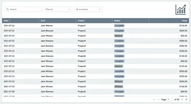
A list screen rarely needs the same data as a detail page. If your API returns everything about everything, you pay twice: the database does more work, and the browser receives and renders more than it can use. Query shaping is the habit of asking only for what the list needs right now.
Start by returning only the columns needed to render each row. For most dashboards, that's an id, a couple of labels, a status, an owner, and timestamps. Large text, JSON blobs, and computed fields can wait until the user opens a row.
Avoid heavy joins for the first paint. Joins are fine when they hit indexes and return small results, but they get expensive when you join multiple tables and then sort or filter on the joined data. A simple pattern is: fetch the list from one table fast, then load related details on demand (or batch-load for the visible rows only).
Keep sorting options limited and sort by indexed columns. "Sort by anything" sounds helpful, but it often forces slow sorts on large datasets. Prefer a few predictable choices like created_at, updated_at, or status, and make sure those columns are indexed.
Be careful with server-side aggregation. COUNT(*) on a huge filtered set, DISTINCT on a wide column, or total pages calculations can dominate your response time.
A practical approach:
COUNT and DISTINCT as optional, and cache or approximate when possibleIf you build internal tools on Koder.ai, define a lightweight list query separately from the details query in planning mode, so the UI stays snappy as data grows.
If you want a list screen that stays fast at 100k rows, the database has to do less work per request. Most slow lists aren't "too much data." They're the wrong data access pattern.
Start with indexes that match what your users actually do. If your list is usually filtered by status and sorted by created_at, you want an index that supports both, in that order. Otherwise the database may scan far more rows than you expect and then sort them, which gets expensive fast.
Fixes that usually deliver the biggest wins:
tenant_id, status, created_at).OFFSET pages. OFFSET makes the database walk past many rows just to skip them.A simple example: an internal Orders table that shows customer name, status, amount, and date. Don't join every related table and pull full order notes for the list view. Return just the columns used in the table, and load the rest in a separate request when the user clicks an order.
If you're building with a platform like Koder.ai, keep this mindset even if the UI is generated from chat. Make sure the generated API endpoints support cursor pagination and selective fields, so database work stays predictable as the table grows.
If a list page feels slow today, don't start by rewriting everything. Start by locking down what normal use looks like, then optimize that path.
Define the default view. Pick the default filters, sort order, and visible columns. Lists get slow when they try to show everything by default.
Choose a paging style that matches your usage. If users mostly scan the first few pages, classic pagination is fine. If people jump deep (page 200+) or you need stable performance no matter how far they go, use keyset pagination (based on a stable sort like created_at plus an id).
Add virtualization for the table body. Even if the backend is fast, the browser can choke when it renders too many rows at once.
Make search and filters feel instant. Debounce typing so you don't fire a request on every keypress. Keep filter state in the URL or a single shared state store so refresh, back button, and sharing a view work reliably. Cache the last successful result so the table doesn't flash empty.
Measure, then tune queries and indexes. Log server time, database time, payload size, and render time. Then trim the query: select only the columns you show, apply filters early, and add indexes that match your default filter + sort.
Example: an internal support dashboard with 100k tickets. Default to Open, assigned to my team, sorted by newest, show six columns, and only fetch ticket id, subject, assignee, status, and timestamps. With keyset pagination and virtualization, you keep both the database and the UI predictable.
If you build internal tools in Koder.ai, this plan maps well to an iterate-and-check workflow: adjust the view, test scroll and search, then tune the query until the page stays snappy.
The fastest way to make a list screen feel broken is to treat 100k rows like a normal page of data. Most slow dashboards have a few predictable traps.
One big one is rendering everything and hiding it with CSS. Even if it looks like only 50 rows are visible, the browser still pays for creating 100k DOM nodes, measuring them, and repainting on scroll. If you need long lists, render only what the user can see (virtualization) and keep row components simple.
Search can also quietly wreck performance when every keystroke triggers a full table scan. That happens when filters aren't backed by indexes, when you search across too many columns, or when you run contains queries on huge text fields without a plan. A good rule: the first filter a user reaches for should be cheap in the database, not just convenient in the UI.
Another common issue is fetching full records when the list only needs summaries. A list row usually needs 5 to 12 fields, not the whole object, not long descriptions, and not related data. Pulling extra data increases database work, network time, and frontend parsing.
Exporting and totals can freeze the UI if you compute them on the main thread or wait for a heavy request before responding. Keep the UI interactive: start exports in the background, show progress, and avoid recalculating totals on every filter change.
Finally, too many sort options can backfire. If users can sort by any column, you'll end up sorting large result sets in memory or forcing the database into slow plans. Keep sorts to a small set of indexed columns, and make the default sort match a real index.
Quick gut check:
Treat list performance like a product feature, not a one-time tweak. A list screen is fast only when it feels fast while real people scroll, filter, and sort on real data.
Use this checklist to confirm you fixed the right things:
A simple reality check: open the list, scroll for 10 seconds, then apply a common filter (like Status: Open). If the UI freezes, the problem is usually rendering (too many DOM rows) or a heavy client-side transform (sorting, grouping, formatting) happening on every update.
Next steps, in order, so you don't bounce between fixes:
If you build this with Koder.ai (koder.ai), start in Planning Mode: define the exact list columns, filter fields, and API response shape first. Then iterate using snapshots and rollback when an experiment slows the screen down.
Start by changing the goal from “load everything” to “show the first useful rows fast.” Optimize for time to first row and smooth interaction when filtering, sorting, and scrolling, even if the full dataset is never loaded at once.
Measure time to first row after a load or filter change, time for filter/sort to update, response payload size, slow database queries (especially wide selects and counts), and browser main-thread spikes. Those numbers map directly to what users perceive as “lag.”
Temporarily cap the API to return only 20 rows using the same filters and sorting. If it becomes fast, you’re mainly paying for query cost or payload size; if it’s still slow, the bottleneck is usually rendering, formatting, or client-side work per row.
Don’t render thousands of rows in the DOM at once, keep row components simple, and prefer a fixed row height. Also avoid doing expensive formatting work for off-screen rows; compute and cache formatting only when a row is visible or opened.
Virtualization keeps only the visible rows (plus a small buffer) mounted, reusing DOM elements as you scroll. It’s worth it when users scroll a lot or rows are “heavy,” but it works best when row height is consistent and the table layout is predictable.
Pagination is the safest default for most admin and internal workflows because it keeps users oriented and limits server work. Infinite scroll can be fine for casual browsing, but it often makes navigation and memory usage worse unless you add clear state handling and limits.
Offset pagination is simpler but can get slower as you go deeper because the database may skip more rows. Keyset (cursor) pagination usually stays fast because it continues from the last seen record, but it’s less suited to jumping to an exact page number.
Don’t run a request on every keystroke. Debounce the input, cancel in-flight requests when a new one starts, and default to narrowing filters (like recent dates or “my items”) so the first query is small and useful.
Return only the fields the list actually renders, usually a small set like id, label, status, owner, and timestamps. Move big text, JSON blobs, and most related data to a detail request so the first paint stays light and predictable.
Make the default filter and sort match real usage, then add indexes that support that exact pattern, often a composite index combining tenant/filter fields with the sort column. Treat exact totals as optional; show them later, cache them, or approximate them so they don’t block the main list response.