Dec 16, 2025·6 min
Farmers market vendor list with a phone-friendly booth map
Create a farmers market vendor list that includes a simple booth map page, designed for phones, quick updates, and easy navigation on market day.
Create a farmers market vendor list that includes a simple booth map page, designed for phones, quick updates, and easy navigation on market day.
On market day, people aren’t browsing. They’re walking in with a coffee, squinting in the sun, and trying to find one booth before it sells out. Vendors have the same problem in reverse: where to set up, whether a spot changed, and what time load-in starts.
A simple farmers market vendor list helps, but it still misses the question people have in the moment: where is that vendor right now? Without booth locations, visitors wander rows, ask other shoppers, or give up and buy something else.
“Easy on phones” isn’t about fancy design. It means the page loads fast, text is readable without zooming, and the main actions are reachable with a thumb. If the map takes forever to load, vendor names are tiny, or people have to pinch and pan to understand the layout, the page fails when it matters.
This page should work in under 10 seconds: confirm today’s hours and status, help someone find a vendor by name or category, show a clear booth label that matches the map, make changes obvious (moved booths, cancellations, special layouts), and reduce questions at the info tent and on social media.
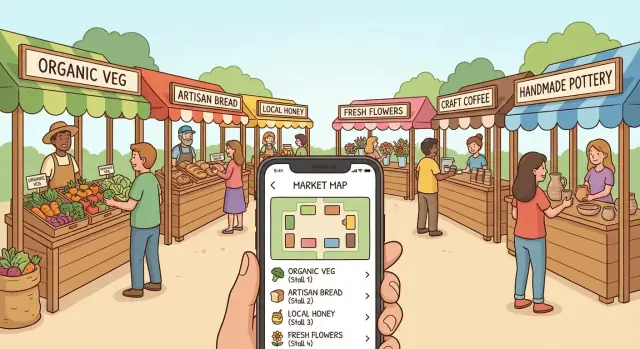
A real example: someone arrives late and wants the honey vendor they saw last week. They don’t want a long story about the market. They want to tap the directory, spot “Honey,” see “Booth B12,” and glance at a map that shows where B12 is relative to the main entrance.
Keep that “walking speed” use case in mind and design choices get simpler: fewer distractions, bigger labels, and a straight path from name to location.
People open this page for one reason: find a vendor fast, then walk to the right spot without guessing. Publish only what helps that moment and the page stays short, loads quickly, and is easier to keep accurate.
Start with basics visitors look for immediately: market name, exact address, the entrance to use, dates or season window (for example, Saturdays May to October), and hours that reflect reality (including when vendors start packing up). Add quick parking guidance and one short accessibility note (ramps, flat routes, stroller-friendly paths).
Then publish the vendor directory for quick scanning. Broad categories do most of the work: Produce, Baked goods, Prepared food, Crafts, Plants/flowers. Don’t make people learn your system.
Each vendor entry only needs a few fields to be useful: the name on their sign, one primary category, a booth/row ID that matches the map and aisle signs, and a short highlight (1-2 items people come for). Payment notes like “cash only,” “cards,” or “SNAP” help too, but only if you can keep them accurate.
Plan for day-of changes. Even a single “Today’s updates” line makes the page feel trustworthy: “Honey House: sold out by 11:30” or “Sunny Bread: moved from B3 to B7.” Keep updates short and time-stamped.
Most visitors will open your farmers market vendor list while walking, holding a bag, and dealing with glare. The goal is simple: find the vendor, confirm the booth, and move.
Put a search box at the top and keep it available as people scroll. A sticky header works well on phones, as long as it stays thin: search field plus one filter button.
Filters should match how people ask questions. Few people search “Vendor #42.” They search “coffee,” “eggs,” or “gluten free.” Keep filters limited to the ones that matter most for your market, such as category, payment type, dietary needs, and a simple “Here today” status if your lineup changes week to week.
Vendor cards should stay compact. If one vendor takes a full screen, people quit. Aim for the essentials: vendor name (largest text), category (small tag), booth label that matches your signs, and short payment notes like “Card + SNAP.” Add a one-line blurb only if it’s genuinely helpful.
Make the booth label tappable. When someone taps it, show the booth location without losing their place. Two options work well on phones: a small bottom sheet with the map focused on that booth, or a map view with a clear “Back to list” button that returns to the same scroll position.
Example: Jamie searches “honey” while walking in. They see three results, tap “B12,” the map opens centered on B12, and one tap takes them back to the honey results.
A booth map that looks fine on a laptop can be frustrating on a phone. The goal is straightforward: someone should find Booth 18 quickly while walking, in sunlight, with one hand.
Start with a layout that matches how people move through the market. For many markets, a clean grid with booth numbers and clear row letters is easier than a detailed drawing. If your site has entrances, trees, or a stage, group booths into simple zones like “A: Main Row” and “B: Back Row.” Keep shapes simple.
Make booth labels big and high contrast. Tiny numbers are the main reason people pinch-zoom, lose their place, and give up. A “You are here” marker can help, but treat it as optional. What matters more is that booth numbers and zone names match what’s printed on real signs.
Give visitors two ways to view the map: an overview with the whole market plus key landmarks (entrance, info tent, restrooms), and a detail view split into sections (for example, Row A and Row B) with larger booth numbers. Under the map, include a simple text fallback like “Row A booths 1-20, Row B booths 21-40” for quick scanning.
Design for weekly changes. If Booth 12 and 13 merge, show one larger box labeled “12-13” and reflect it in the vendor list too. If a vendor moves, keep the booth number as the source of truth. Mark the old spot as “empty” rather than renumbering mid-season.
Example: a visitor searches the vendor list for “Honey” and sees “Sunny Apiary, Booth 27 (Zone B).” They tap Zone B, open the detail view, and the large numbers make Booth 27 obvious without heavy zooming.
People don’t get lost because your map is “wrong.” They get lost because the map and real-world signs use different words. If your page shows “Local Honey,” but the booth sign only says “B12,” visitors hesitate and stop trusting the page.
Pick one naming scheme you can keep every week: Booth 1-40, A1-A10, or simple zones like Produce Row and Food Court. Choose what fits your space. A tight grid often works well with A1-style labels, while a long street market reads better as rows or zones.
Once you choose it, use the exact same labels everywhere: on the booth map page, printed signs, chalkboards, and any “You are here” board. If volunteers help with setup, give them the same label sheet so numbers don’t drift.
Add a few landmarks so the map feels real on a small screen. Three to six is plenty: info tent, restrooms, stage/music, main entrance/exits, and maybe an ATM or first aid. Keep the legend short enough to read without zooming.
Example: a visitor taps “Sourdough Bakery” and sees “Booth B7 (near Music).” When they arrive, the nearest sign also says “B7,” and the stage banner matches the map. They walk straight there instead of asking around.
Get vendor details into one place before you touch the website. A shared spreadsheet works fine, or a short form that feeds a sheet. The point is one source of truth so you’re not chasing messages the night before.
Then lock down booth labels (or row and spot) and confirm them. A quick “reply YES to confirm booth 14” prevents the most common problem: vendors showing up expecting a different location than what you published.
A practical build order that reduces rework:
Do one real-world test: stand where visitors enter, open the page one-handed, and try to find three vendors in under 20 seconds. If you can’t do it, simplify labels, reduce clutter, or reorder the list.
Also pick one person (not a group chat) to publish morning changes. That single decision prevents conflicting updates and keeps the page trustworthy.
Most people open your page while walking and trying to find one booth fast. Small friction turns into “never mind” in seconds.
Overload is a frequent problem. Long vendor stories, lots of photos, and big blocks of text make a vendor list feel like homework. If someone just wants “Who has peaches?” they shouldn’t have to scroll past paragraphs and banners.
The map is the next big drop-off point. If your booth map is one image with tiny labels, people pinch-zoom, lose their place, and quit. A phone-friendly map needs labels you can read at normal zoom and enough spacing that fingers can tap accurately.
Label mismatch creates instant confusion. If the online map says “A12” but the real sign says “12” (or “Row A - 12”), people stop trusting the page. The same goes for vendor names: “Sunny Farm Co.” online vs “Sunny Farms” on the booth sign feels like two different vendors.
Another issue is hiding basics. Hours, address, and “Where do I enter?” should be above the directory. People use this page to decide if they can still make it today.
Finally, markets change. If you don’t plan for last-minute swaps, your page becomes wrong at the worst time. Someone comes for “Green Truck Tacos,” walks to the marked spot, and finds a jewelry booth instead. They won’t check your page again next week.
A few fixes prevent most drop-offs: keep vendor entries short (name, booth, category, payment notes if needed), match booth labels to printed signs, make the map readable without zooming (even if it means fewer details), put hours and address at the top, and decide who updates changes and how fast.
Test the page like a visitor would: on a phone, on cellular data, in bright light, with one hand. Problems that seem minor on a laptop are exactly what make people give up on market morning.
Focus on the checks that matter most: it should load quickly on cellular, be readable without zooming, make search and filters obvious, show booth labels that match on-site signs, and keep key info and updates foolproof (including who updates changes and how they confirm it’s live).
One practical test: ask a friend who has never been to your market to find two vendors and their booth numbers in under 20 seconds, outdoors. If they hesitate, simplify names, move important info higher, or reduce clutter on the map.
It’s Saturday at 9:05 a.m. Your market has 45 vendors and two entrances: North Gate (near the parking lot) and South Gate (near the playground). A visitor opens the directory on their phone while walking in.
They type “Lopez” into the search bar. The directory narrows to one card: Lopez Honey. The card shows a booth label that matches on-site signs, like B12, plus a short hint: “Row B, near North Gate.” There’s also a simple “Show on map” action that jumps the map to the right spot.
In under a minute, they do three quick checks: confirm the booth label matches the nearest row marker, use the map highlight to pick a fast path from North Gate, and glance at the card for one useful detail, like “accepts cards.”
Today there’s a last-minute change: Lopez Honey swapped booths with a neighboring vendor. Instead of confusing people, the card shows Moved to B14 (today only). On the map, B12 stays labeled but is marked “Moved,” and B14 is highlighted.
One booth is temporarily empty because a vendor is delayed. The map still shows the booth label, but it’s lightly greyed out with “Empty right now” so visitors don’t wander in circles. The vendor card still appears, but it reads Arriving late instead of disappearing.
A vendor list and booth map only help if they match what people see when they arrive. The easiest way to keep them right is to make updates a job, not a scramble. Pick one person who “owns” the page each market day. That doesn’t mean they do all the work, it means everyone knows who has final say.
Keep changes in one small running log you update the same morning: who canceled, who swapped booths, and any late adds. Reuse the same page every week and add a date-specific note at the top so returning visitors know it’s current.
A simple weekly routine stays manageable even when things get busy: check confirmations before setup, do a quick walk to confirm booth numbers during setup, update the top note with the real changes, then fix anything you got wrong within 10 minutes after opening.
Plan for growth by keeping a consistent vendor card format (name, category, booth, payment notes, and one short highlight). Adding a new vendor should feel like filling in blanks, not redesigning the page.
Turn your layout into a real page with three blocks people can understand quickly: the farmers market vendor list, simple filters, and a booth map that’s usable on a phone.
Start small and publish early. A plain list that loads fast beats a perfect design that never ships. Add polish after you see what questions visitors still ask at the info tent.
If you want a faster build process, Koder.ai (koder.ai) can generate a simple directory page from chat and help you iterate in Planning Mode before changes go live. Snapshots and rollback are useful when you need to undo a rushed edit on market morning.
Keep your future self in mind. At the end of the season, save your vendor data and map file, and export the source code so next year is an update, not a rebuild.
Start with market hours and status, then a search-first vendor directory, then a booth label that matches on-site signs, and finally a map that highlights that booth. If those four pieces work quickly on a phone, most visitors will succeed without extra content.
Use broad, familiar categories and make the search box the primary tool. Most people will type what they want (like “honey” or “coffee”) rather than browse a complex taxonomy.
Use the name exactly as it appears on the vendor’s sign, show one main category, and display a booth ID that matches the map and aisle markers. Add a short “known for” note only if it helps someone confirm they found the right booth.
Treat the booth ID as the source of truth and keep it consistent all season. If a vendor moves, update the vendor card to the new booth and mark the old booth as moved or empty instead of renumbering everything.
Put a small, time-stamped “Today’s updates” area near the top and keep it short. Only post changes that affect someone’s walk, like cancellations, sold-out notes, booth swaps, and temporary layouts.
Make labels large, high-contrast, and readable at normal zoom, and avoid packing too many details into one image. A simple grid with row letters or zones is often easier to use while walking than an illustrated map.
Choose one labeling system (like A1–A20 or Booth 1–40) and use it everywhere: online, printed signs, and any “You are here” boards. Even small mismatches make people stop trusting the page and start asking for help.
People miss the basics when they’re in a hurry, so put hours, exact address, and which entrance to use above the directory. Add one short parking note and one accessibility note so visitors don’t need to hunt for essentials.
Do a one-handed test at the entrance on a real phone and try to find three vendors in under 20 seconds. If it feels slow or confusing, simplify the vendor cards, increase label size, or reduce map detail until it’s effortless.
Pick one person to own updates on market morning and decide what counts as official before changes go live. If you build with Koder.ai, you can iterate in Planning Mode and use snapshots and rollback to quickly undo a bad edit when you’re rushed.