Aug 04, 2025·7 min
Empty state design that drives setup completion in apps
Empty state design patterns that reduce confusion and guide users to the next successful setup step, with copy, layout, and checklists you can apply fast.
Empty state design patterns that reduce confusion and guide users to the next successful setup step, with copy, layout, and checklists you can apply fast.
A blank screen isn't neutral. It creates a pause where people start guessing what to do, whether they missed a step, or whether the product works at all. During setup, that pause is expensive. It turns "I'm getting started" into "I'll come back later."
An empty state is what a user sees when there's nothing to show yet because they haven't created, imported, or connected anything. It's not a loading screen, an error message, or a permissions warning. It's the moment right before value, when the app needs to help the user get to a first meaningful result.
A good empty state has one job: move the user to the next successful action with as little thinking as possible. "Successful" matters. The next step should produce a real outcome (a first project, a connected data source, a first item created), not a dead-end form or a vague product tour.
These moments show up more often than teams expect: first login after signup, a brand-new workspace, a feature tab with no items yet (projects, customers, files), or a setup path where import was skipped and nothing exists.
When an empty state does its job, it answers three questions quickly:
Example: in Koder.ai, a new user can open a fresh workspace and see no apps yet. A strong empty state says plainly that nothing has been created, offers one obvious next action like "Create your first app," and adds a small safety note (for example, that source code export and snapshots exist once they start). The goal is to turn "nothing here" into "I can get to a first working result."
For a first-time user, an empty screen can feel like the app stalled or like they did something wrong. The mind fills the gap fast, and usually not in your favor.
Most people are silently asking the same set of questions:
The emotions behind those questions drive behavior. Uncertainty makes people hover. Fear of doing it wrong makes them avoid the primary button. Impatience makes them close the app if a clear next step doesn't show up in a few seconds.
New-user empty states and power-user empty states solve different problems. New users need context and safety because they don't know your vocabulary yet. Returning users want speed: a quick way to create another item, import data, or repeat a familiar action.
Setup empty states also differ from error and loading states. Loading says "wait, something is happening." Error says "something failed, here's why." Setup says "nothing is here yet, and that's normal. Here's how to start."
A concrete example: if someone opens a new workspace in Koder.ai and sees an empty Projects page, they're not thinking about features. They're thinking, "Do I start from a prompt, import code, or pick a template, and will it break anything?" Your empty state should answer that without sending them to documentation.
A good empty state doesn't feel empty. It acts like a signpost: "Here's what this is, and here's the next click."
A structure that works in most setup flows has three parts:
Keep the explanation tight. If you need a paragraph to explain the screen, you're asking users to think too hard. Aim for 1 to 2 short sentences with plain words like "Add your first project" or "Create your first workspace."
Then make the next step obvious with a single primary button. If you show three equal buttons, you're asking the user to choose a path before they understand the page. If you must offer alternatives (import, template, skip), keep them visually quieter than the main action.
Use the reassurance line to remove common fears: making a mistake, wasting time, or needing technical skills. Small hints about what happens next and what can be undone help more than extra explanation.
Example copy for a first-time "Projects" screen:
Title: Start your first project
Explanation: Projects hold your app setup and releases.
Primary action: Create project
Reassurance: Takes about 2 minutes. You can rename it anytime.
If your product supports multiple ways to start (build from chat, import, or template, like tools such as Koder.ai), keep "Create" as the default and place "Import" and "Use a template" as secondary actions below.
Empty states fail when the copy talks about features instead of what the user gets. Your words should quickly answer: What is this screen? Why should I do anything here? What should I do next?
A simple headline formula is Outcome + object. Name the result and the thing they'll create, not your internal feature name.
For body copy, use what it is + why it matters in one or two sentences:
"Customers are the people you sell to. Add one now so you can send an invoice and track payments."
CTAs should start with a clear verb and include a specific noun. Avoid vague buttons like "Get started" when there are multiple paths.
Add microcopy right next to the choice that feels risky. Small reassurances often do more than long explanations:
If your product generates output for the user (like Koder.ai), set expectations so people know they're not committing to a final version: "We'll create a first draft. You can review and edit before deploying."
A good empty state should read like a signpost, not a poster. The layout needs a clear order so people can glance once, understand what's going on, and act.
Use a simple hierarchy that matches how eyes scan a page: headline, one short sentence, a primary CTA, then a quieter secondary action (import, template, skip).
Keep the primary button close to the message. If the user has to read, scroll, and then decide, they often stop. A common pattern is a tight block (headline + body + CTA), with more whitespace between that block and everything else (navigation, footer, side panels).
Icons and small illustrations can help scanning, but only if they add meaning. A folder icon next to "No projects yet" is useful. A random mascot usually isn't. If you use an illustration, keep it small and place it above the headline so it doesn't compete with the CTA.
One of the strongest patterns is showing a tiny preview of success: a sample card, a single demo row in a table, or a faded example tile. In a tool like Koder.ai, the empty "Apps" screen could show one sample app tile (name, status, last updated) so users instantly understand what they're about to create.
When someone hits an empty screen, they usually want one of three things: start fresh, bring data in, or move fast with a starter. Good empty states make those paths clear without forcing the user to study the product.
Lead with "Create" when the first real win is making a new thing: a project, workspace, page, or first record. This works best when the user can finish quickly and the action is reversible.
If creation takes longer, break it into a smaller first step (for example, "Create a draft") so they can move forward without feeling locked in.
Lead with "Import" when most new users arrive with an existing system, file, or account to connect. The empty state should state what import supports and what they get after (for example, fields mapped and items created).
A practical way to pick the primary CTA is to use context. If the user is coming from migration content, highlight Import. If they clicked a blank "new project" button, highlight Create. If setup is complex, highlight Template.
Lead with templates when your product has common starting points and users mainly want to adapt, not design. Name templates by outcome ("Sales pipeline", "Weekly planner"), not features.
A safe "Try with sample data" option reduces fear. Make it clear it can be deleted. For a chat-first builder like Koder.ai, a sample project can show the shape of a working app before the user writes their own prompt.
Empty screens aren't neutral. The best ones make the next successful action feel obvious, safe, and quick.
Pick one setup milestone to drive. Choose the single action that proves the user is getting value (create the first project, add the first teammate, connect the first data source). When you try to support three goals at once, users freeze.
Reduce inputs to the minimum. Keep only what's required to reach that milestone. Optional fields can live behind "Add details" after the first win.
Write the core elements in this order:
Add reassurance and an escape hatch. Answer the quiet worry: "Will I break something?" A short line like "You can edit this later" plus an obvious way to undo, edit, or delete reduces hesitation.
Test with 3 people, then track completion. Watch where they pause and what they click first. After launch, track empty state views, primary CTA clicks, and milestone completion rate.
Example: if someone opens a new CRM and sees an empty "Contacts" tab, the fastest win is "Add your first contact." Keep it to name + email, offer "Import CSV" as the fallback, and reassure them they can update fields later.
Most "stuck" empty states fail for one reason: they make the next move feel risky or unclear.
If you show three buttons that look equally important, users pause. Pick one primary action and one secondary. Put everything else behind a quiet "More options" line.
"Powerful dashboards, flexible roles, advanced settings" doesn't tell people what to do right now. Replace it with the next outcome they get after clicking.
Examples:
Long forms in an empty state feel like commitment. If you need details, earn them later. Start with the smallest step that produces something visible.
Instead of requesting name, company size, role, and goals before anything loads, ask only for "Project name" and make the rest optional once the first screen exists.
Humor is fine, but not where the user needs clarity. "Nothing to see here" wastes the moment. Say exactly what will happen after the click, and what won't happen.
Some users can't create from scratch. Offer a real backup path: import, start from a template, or try a sample. For example, if someone is using Koder.ai and doesn't have an idea ready, "Start from a sample app" can get them to a working screen without writing a full spec.
A new user should understand what the screen is, why it matters, and what to do next in about five seconds.
Reassurance is what turns hesitation into action. Add a small line near the CTA that reduces fear, like "You can change this later" or "Nothing is published until you confirm." Keep it calm and specific.
A simple test: ask a teammate to glance at the screen for five seconds, then tell you what they think will happen if they click the main button. If they can't answer, tighten the copy or hierarchy.
If you're building setup flows in a chat-first builder like Koder.ai, the same checklist applies. The empty state should invite one successful next action: start from a template, import data, or generate a first working version you can edit safely.
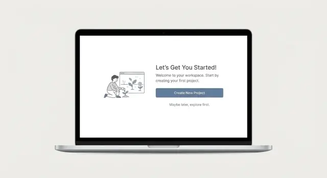
A solo founder signs up for Koder.ai and opens a brand-new workspace. They land on a Projects screen with zero apps and no idea what "good" looks like yet.
Instead of a blank table, the empty state shows a short promise, a clear next step, and a small safety note. Here's one example of the copy and CTA (treat time estimates as placeholders you should validate):
Your workspace is empty.
Create your first app in 5 minutes. Start with a template or describe what you want in plain English.

[Create your first app]
Secondary: Import existing code  |  Browse templates
Note: You can export the source code anytime.
After the founder clicks Create your first app, the next screen asks one simple question: "What are you building?" with a single input and 2 example prompts (like "CRM for a small agency" or "Landing page with signup"). Keep the path narrow: one obvious field, one obvious button.
Screen two can be a quick plan review (features, pages, data), followed by a build step and a working preview. The first success moment is when the user can do one real thing in that preview, like adding a record or submitting a test signup.
Once data exists, returning users shouldn't see the same empty state again. The Projects screen can shift to a "recent apps" view with one prominent quick action (for example, New app) and smaller actions (like Snapshots or Deploy) based on what they did last time.
To know whether your empty state is doing its job, track a few numbers:
Pick one setup flow to improve this week. Choose the one with the biggest drop-off, or the one new users hit first. Rewrite its empty state so it answers three questions fast: What is this? Why should I do it now? What's the next click?
Keep the change small. You're not redesigning onboarding. You're making the first successful action feel obvious.
A simple one-week plan:
After you get one win, standardize. Create a short internal pattern for empty states: spacing, headline style, icon or illustration rules, and a consistent CTA layout. When teams follow the same structure, users learn it once and move faster everywhere.
If you're building a new app and want to prototype setup steps quickly, Koder.ai (koder.ai) can help you draft a flow in Planning Mode and generate the first version to test, then iterate based on where people actually hesitate.
An empty state is what users see when there’s nothing to show yet because they haven’t created, imported, or connected anything. It should explain what the screen is for and point to the next successful action, rather than leaving users guessing.
A loading screen says “wait, something is happening,” and an error state says “something failed, here’s why.” A setup empty state says “nothing is here yet, and that’s normal,” then guides the user to create, import, or start from a template so they can reach a first real result.
Aim to answer three things fast: what this screen is, why it’s empty, and what to do next. If users can’t understand those within a few seconds, they’re more likely to pause, worry they did something wrong, or leave.
Use a simple structure: a short explanation of what the area is for, one obvious primary action, and one reassurance line that reduces fear or effort. Keep the text tight so users don’t have to read a paragraph to know what to click.
Default to one primary button that matches the most common next step, and make everything else clearly secondary. If you show multiple equal buttons, people often freeze because they don’t know which path is “right.”
Lead with “Create” when starting from scratch is the fastest way to a visible win, like a first project or first record. Lead with “Import” when most new users already have data elsewhere, and lead with “Template” when users mainly want speed and a proven starting point.
Write headlines as an outcome plus the object, like “Create your first project,” instead of feature labels like “Projects.” For the body text, add one sentence that says what happens after the click so users can predict the result.
Place the headline, one short sentence, and the primary button in a tight block with clear visual hierarchy. Keep secondary actions quieter and close by, and avoid pushing the main button far down the page where users have to scroll or hunt for it.
Put a short safety note near the action, such as “You can change this later” or “Nothing is published until you confirm.” In tools like Koder.ai, it can also help to mention reversible actions like snapshots/rollback or the ability to export source code once they start building.
Track how often users view the empty screen, click the primary CTA, and complete the milestone it’s meant to drive. Also watch time to first success and drop-off between the empty state and the next step, since an empty state can get clicks but still fail to produce results.