Apr 25, 2025·8 min
How to Build a Marketplace Landing Page Without Complex Logic
Learn how to build a marketplace landing page that validates demand without complex marketplace features. Includes structure, tools, SEO, and lead capture.
Learn how to build a marketplace landing page that validates demand without complex marketplace features. Includes structure, tools, SEO, and lead capture.
Building a marketplace landing page “without full marketplace logic” means you’re creating the story, positioning, and conversion path of a marketplace—without building the software features that make a marketplace run end-to-end.
You’re not aiming for automation yet. You’re aiming for clear signals.
Before you invest in accounts, profiles, search, messaging, payouts, and admin panels, decide what you’re trying to prove:
A “no-logic” version is successful if it produces a clear signal, not if it feels feature-complete.
Most marketplaces have two audiences:
Your landing page should make a straightforward promise to each side—even if you handle the matching manually behind the scenes.
Choose one or two primary metrics:
“No marketplace logic” typically means no accounts, no automated matching, no in-app messaging, no inventory sync, and no seller onboarding flow.
Instead, your site captures intent and you deliver the outcome manually (for now).
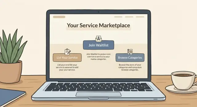
A marketplace-style landing page works best when it makes one clear promise and asks for one clear action. If you try to “serve everyone,” visitors won’t know whether they’re in the right place—and you won’t know what to measure.
Start with a single outcome you can deliver in the next 2–4 weeks. Examples:
Then pick one primary call-to-action (CTA) that aligns with that outcome: Request matches, Join the waitlist, or Apply to list. Keep everything else secondary.
Use this format:
For [specific audience], we help you [specific outcome] without [common pain].
Example: “For early-stage founders, we help you find pre-vetted fractional CFOs without weeks of interviews.”
Avoid aspirational claims that require automation you don’t have yet. Strong launch-ready differentiators include:
If buyers are the bottleneck (they need trust), start demand-first and collect requests. If sellers are scarce or quality varies, start supply-first and curate a tight set of providers.
Pick one side to prioritize so your page tells a single story—and has a single conversion goal.
A marketplace-style landing page works best when it feels browseable even if nothing is searchable yet. Your goal is to give visitors enough structure to understand what’s available, who it’s for, and what to do next—without building profiles, accounts, or complex filters.
Start with a small, deliberate sitemap:
A clean starting point:
Structure the homepage like a guided tour:
Even without accounts, clarity builds trust. Include a short split explanation:
If your model is still changing, avoid vague pricing. If it’s simple, state it directly (e.g., “Free to request; providers pay a referral fee” or “Flat monthly listing”). If not, say “Pricing varies by category—request a quote.”
A marketplace homepage doesn’t need real-time inventory or user accounts to feel like a marketplace. Your job is to help visitors instantly understand:
Within the first screen, be explicit about:
If you have two distinct audiences, use two CTAs (side-by-side, equal weight): “Join as a buyer” and “Apply as a seller.” Each should go to a short form, not a login.
Even without a database, you can simulate inventory with:
Trust elements should be real and verifiable: short testimonials, clear vetting criteria, and only genuine partner/customer logos.
If you have numbers, qualify them (“12 providers vetted so far,” “48 requests processed”). When you don’t, replace hype with process: “Reviewed within 24 hours” and “Hand-matched by a human.”
A marketplace-style landing page doesn’t need a real-time database on day one. You can create the feeling of choice and credibility with a small set of curated listings—or clearly labeled examples—that you add manually.
Keep every card consistent so it’s easy to scan:
If you’re using Webflow, WordPress, Carrd, or Notion, these can be static blocks. You can always move them into a CMS later—don’t let “dynamic inventory” be the reason you delay launch.
Start with 6–15 listings you can confidently describe. This can be:
Accuracy matters. If something is an example, label it clearly.
Place a small badge on every listing: “Example”, “New”, “Accepting requests”, or “Waitlist.” This reduces confusion and prevents mismatched leads.
Avoid multiple competing CTAs. Pick one: a short form, a single email link, or a booking link. Route everything through one page like /request so you can track conversion cleanly.
If you’re skipping full marketplace logic, your “signup” flow should feel effortless. Accounts, passwords, and profiles add friction and support work—forms don’t.
Don’t force everyone into one generic form. Use two buttons (e.g., “I’m looking for help” and “I offer this service”) that lead to separate forms. This removes confusion and helps you ask only what matters for that side.
Keep each form to the smallest set of fields needed to fulfill the request.
For buyers: what they need, location/timezone, budget range (optional), and how to contact them.
For sellers: what they offer, availability, starting price (optional), and a link to proof (portfolio/LinkedIn).
Long applications can wait until you’ve validated demand.
Send submissions to a Google Sheet, Airtable, Notion database, or a lightweight CRM. Set up an automatic email response that confirms receipt and explains the next step (“We’ll reply within 24 hours with 1–3 matches” or “We’ll review and request details if needed”).
If you have a short screening step, include a scheduling link in the auto-reply.
Add CAPTCHA (or equivalent), and use double opt-in for email lists when appropriate. Include clear consent language near the submit button (e.g., permission to contact them about matches) and link to /privacy.
You don’t need profiles, messaging, or matching algorithms to deliver the “marketplace” experience. Your first job is to create a reliable request → intro → next step pipeline that you can run by hand.
On each listing (or on a general “Get matched” section), add one primary CTA: Request an intro.
Keep the form short: who they are, what they need, budget/range (optional), timeline, and contact email. Once it’s submitted, you manually match them to one or two suitable providers and introduce them via email.
Instead of building availability logic, route qualified requests to a scheduling link (Calendly-style). Use two links:
This reduces back-and-forth and makes the experience feel immediate.
Templates keep your tone consistent and help set expectations. Here are two you can copy:
Subject: Got it — we’re matching you with the right fit

Hi {{Name}},

Thanks for the request. We’ll review it and email you 1–2 recommended options within {{time_window}}.

If anything is urgent or you have constraints (budget, dates, location), reply here and we’ll factor it in.

— {{YourName}}
Subject: Intro: {{Buyer}} ↔ {{Provider}}

Hi {{Provider}}, hi {{Buyer}},

Connecting you both based on {{one-line reason}}.

{{Buyer}} is looking for: {{summary}}.
Next step: book a quick call here: {{link}}.

— {{YourName}}
A lightweight marketplace runs on trust. Be explicit on the page and in confirmations:
These constraints prevent confusion and keep your manual ops sustainable.
You don’t need carts, subscriptions, or a full buyer-account flow to learn what people will pay. A simple payment step can validate pricing faster than surveys—if you’re clear about what buyers get and when.
Use Stripe Payment Links to collect a one-time payment for an initial package (for example: “3 curated introductions” or “one week of sourcing”). Keep the offer narrow and time-bound so you can fulfill it manually.
If you’re not ready to take full payment, offer a refundable deposit. Deposits work well when the service depends on availability and you want to filter for serious buyers.
A paid “priority access” tier can be a strong signal—only if it changes the experience in a real way you can deliver (faster response, higher-touch matching). Avoid vague perks like “VIP benefits” unless they’re defined.
Instead of building seller checkout, collect applications via a form, approve manually, then send an invoice (Stripe Invoice or a simple payment link). This keeps control in your hands while you learn who’s willing to pay and why.
Place a short policy directly next to the payment button:
Clarity here reduces disputes and protects trust while you experiment with pricing.
You don’t need “marketplace software” to launch a convincing marketplace landing page. You need a fast builder, a simple way to collect leads, and a place to review them.
Pick a tool that matches your comfort level and how often you’ll update content:
Use a CMS only if you’ll update categories or curated listings weekly (or at least a few times a month). If you’re not updating regularly, a static “Examples” section is often clearer and faster.
Rule of thumb: if you’re going to publish more than ~15 items and keep them fresh, a CMS helps. Otherwise, keep it simple.
Keep the workflow boring:
Form → email → spreadsheet.
For example: Webflow Forms / Tally / Typeform → notifications in Gmail → rows in Google Sheets (via Zapier/Make). This gives you an inbox alert plus a sortable “pipeline” without building accounts or dashboards.
Once you’ve validated demand, you may want to ship a real MVP without rebuilding everything from scratch. A vibe-coding platform like Koder.ai can help you turn the same flow (categories, listing pages, lead capture, and manual matching) into a working web app via chat—then export the source code or deploy/host it. It’s a practical next step when you’re ready for features like snapshots/rollback, planning mode, and a React + Go + PostgreSQL foundation without committing to a full legacy development pipeline too early.
Small choices build trust and improve conversions:
SEO is how your “marketplace-style” site gets found before you have a real inventory system. The goal is to publish a few pages that match high-intent searches and make it easy for Google (and people) to understand what you offer.
Start with one page per category (e.g., “Dog walkers,” “Bookkeepers,” “Wedding photographers”) and one “best for” page that targets decision queries (e.g., “Best dog walkers for busy professionals”). These pages can be curated and static—you’re optimizing for search intent, not dynamic listings.
Link them from your homepage and keep the URLs clean, like /categories/dog-walkers and /best-for/busy-professionals.
Use plain-language titles that mirror queries:
Aim for one primary phrase per page (category + location, or “best for” + use case) and keep the rest supporting.
Add an FAQ section to category and “best for” pages that answers:
Create clear pathways: link from the homepage to /how-it-works, then to each category page, and cross-link between related categories and “best for” pages. A simple footer nav that repeats these links helps too.
A marketplace-style landing page is only useful if you can tell what’s working. Set up measurement on day one, then change one thing at a time so improvements are real—not guesswork.
Start with a small set of analytics events tied to your conversion goal:
Tools like GA4, Plausible, or PostHog can handle this without heavy setup.
Don’t just count conversions—look for friction. Track:
If you use session recordings/heatmaps, treat them as directional—then validate with event data.
Test high-impact elements first:
Keep each test focused and run it until you have enough traffic to see a consistent trend.
In your main form, include a short prompt like: “What are you looking for?” This often reveals missing categories, unclear wording, or the real job-to-be-done—and it gives you copy for future iterations.
A marketplace-style landing page asks people to share real needs (and sometimes money). Even if you’re running the “marketplace” manually, you still need basic legal pages and clear trust signals so visitors feel safe taking the next step.
Create /terms and /privacy pages and include a short plain-language summary at the top of each.
In your Privacy summary, state:
Also include a clear note on data deletion: explain how users can request deletion and provide a direct email (e.g., [email protected]) for those requests.
If you’re making introductions or sharing curated options, be explicit that you’re not guaranteeing outcomes—for example: results, availability, pricing accuracy, or that a match will be found.
Say what you will do (review requests, respond within X days, make introductions where possible).
Add a visible footer with:
Small clarity upgrades can increase form submissions while preventing misunderstandings later.
Your landing page proves people want the match. The next step is turning the manual concierge work into software—only in the order that reduces risk.
Start with the smallest upgrades that increase successful matches or reduce time spent per match:
A simple rule: if a feature doesn’t clearly improve conversion, trust, or fulfillment speed, postpone it.
If your inventory changes often, you’ll want a real database (or at least a structured CMS) so listings aren’t stuck in static page edits.
At the same time, define a lightweight moderation workflow:
If you can’t answer these, adding user-generated listings too early can create more work than it saves.
Document what you’re doing right now—intake, vetting, matching, introductions, scheduling, follow-ups. For each step, note:
Those notes become your automation spec.
If you want a structured plan, see /blog/marketplace-mvp-checklist. If you’re comparing approaches and costs for the next build stage, start at /pricing.
It means you’re building the positioning + conversion path of a marketplace (what it is, who it’s for, why trust you, and how to take the next step) without building the software that automates the marketplace.
You typically skip accounts, profiles, search/filters, in-app messaging, payouts, and admin tooling—and you fulfill matches manually via email and spreadsheets.
Pick one primary signal you can measure in 7 days:
Track it with a single source of truth (e.g., form → sheet/CRM) so you can see volume and quality, not just traffic.
Start with one core promise you can reliably deliver in 2–4 weeks, then pair it with one primary CTA.
Examples:
Keep everything else secondary (links below the fold) so visitors aren’t split across multiple actions.
Use this template:
For [specific audience], we help you [specific outcome] without [common pain].
Then add 3–5 differentiators you can deliver now, like:
If you have two audiences (buyers and sellers), you can include both—but prioritize one side so the page has a single story.
A practical rule:
Even with two CTAs, ensure one is clearly the “primary” action you’re optimizing.
A simple structure that feels like a marketplace:
/ (homepage)/categories (optional index)/category/[name] (3–8 category pages)/how-it-works (or a homepage section)Use static listing cards to simulate inventory and choice.
Keep each card consistent:
If a listing is only illustrative, label it clearly as to avoid mismatched expectations.
Create two separate paths with minimal fields:
Route submissions to a sheet/CRM and send an auto-reply that states the next step and response time. Keep everything going through one route like /request so tracking stays clean.
Run a simple pipeline: request → manual match → email intro → scheduling.
To make it feel “real” without building messaging/availability:
This reduces confusion and keeps manual ops sustainable.
Yes—if you keep it narrow and explicit.
Good lightweight options:
Place fulfillment timing and refund terms right next to the payment button to reduce disputes and protect trust.
Avoid claims that require automation you haven’t built yet.
/contactOn the homepage, keep the flow tight: hero + CTA → problem → solution → categories → trust → FAQ → repeat CTA.