Sep 22, 2025·8 min
How to Build a Mobile App for Real Estate Browsing
Learn how to plan, design, and build a mobile app for browsing properties—features, data sources, tech stack, testing, and launch tips for real estate teams.
Learn how to plan, design, and build a mobile app for browsing properties—features, data sources, tech stack, testing, and launch tips for real estate teams.
Before wireframes or MLS discussions, get specific about who you’re building for and what the app must accomplish. Real estate browsing sounds universal, but product decisions change dramatically depending on the primary user.
Pick one main group to optimize for:
You can support multiple audiences later, but an early “everyone” approach usually creates confusing navigation and bloated filters.
Decide the single core promise of the first version. Common choices are:
When this is clear, it becomes easier to say “no” to features that don’t serve the main job.
Avoid vanity metrics like downloads alone. Instead, tie success to behaviors that indicate real intent:
Write down constraints you can’t wish away:
This clarity will guide every later decision—from UX to data sources to the tech stack.
Before you write a line of code, validate that your real estate app will solve a specific problem better than what users already have. This step saves months of “building the wrong thing” and helps you choose an MVP you can realistically ship.
Pick 5–8 competitor apps (national portals, local agencies, and one “map-first” product). Read recent reviews and sort them into three buckets: what users love, what they hate, and what they keep asking for.
Look for patterns like:
Write down the gaps you can address without needing massive partnerships on day one.
Keep user stories concrete and testable. For example:
If a story can’t be explained in one sentence, it’s probably too big for MVP.
Your MVP should prove two things: users can find relevant listings fast, and they want to come back. A practical MVP often includes search + core filters, map browsing, property details, and favorites/saved searches. Treat everything else as “nice-to-have” until you have real usage data.
Even if you launch in one city, decide upfront how you’ll scale: multiple cities, languages, additional listing sources, and different rules per region. Document these assumptions now so your data model and screens won’t block growth later.
Where your listings come from will shape everything: coverage, freshness, feature set, legal risk, and ongoing costs. Make this decision early, because switching sources later often means reworking your data model, search, and even UX.
You typically have four paths:
Prefer official integrations:
Before committing, confirm API availability, authentication, quotas, licensing, attribution requirements, and any restrictions on storing data, showing photos, or sending notifications.
Different sources describe the same thing differently. Plan a normalization layer for:
Also plan for real-world quality issues: duplicates, stale listings, missing photos, and conflicting details across sources. Build rules to de-duplicate, flag suspicious entries, and fall back gracefully when fields are missing—users notice inconsistencies immediately.
Good real estate UX is mostly about speed, clarity, and confidence. Users want to scan lots of options quickly, then drill into details only when a listing feels “right.” Your flows should reduce effort at every step.
Start with the core browsing loop and keep it consistent across the app:
Design cards and list items for quick comparison: large photo, price in a strong hierarchy, and 3–5 key facts (beds, baths, sqft, neighborhood, “new”/“price cut”) visible without tapping.
On the detail page, put the most important facts above the fold, with the full description and extras below.
A bottom tab bar usually fits this product best: Home, Search, Map, Saved, Account. From any listing, users should be able to: view details → save → contact/request a tour → return to the same scroll position.
Use readable text sizes, strong contrast, and large tap targets (especially for filter chips, map controls, and photo swipes). Add clear focus states and support dynamic text sizing so the experience stays usable for everyone.
Search and filters are where real estate apps win or lose credibility. Users should instantly understand why they’re seeing a set of listings—and how to change it without getting “stuck” in confusing states.
Begin with the must-have filters and make them easy to reach:
Then add helpful filters that support real-world decisions without overwhelming the first screen: square footage, pets allowed, parking, HOA fee, school zone, year built, lot size, open house, and “newly listed.” Keep advanced options behind a “More filters” panel.
There are two common approaches:
Whichever you choose, show feedback: loading states, updated result counts, and clear empty-state messages (“No homes match—try increasing max price or removing HOA”).
Use filter chips (e.g., “$400–600k,” “2+ beds,” “Pet-friendly”) above results. Add a prominent Reset/Clear all so users can recover quickly from over-filtering.
Default sorting should be predictable (often “Newest” or “Recommended,” with an explanation). Always offer the basics: price (low/high), newest, distance (when location-based), and open houses.
If you use “Recommended,” briefly state what affects it and never hide listings from other sorts.
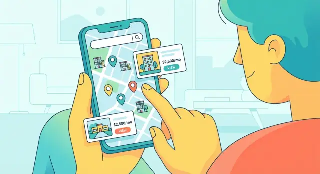
Map browsing is where a real estate app starts to feel “real.” Users can anchor themselves to a neighborhood, see what’s nearby, and quickly adjust their search area without typing.
Pick a provider that fits your platforms and budget (Google Maps, Mapbox, or Apple MapKit for iOS-first). Beyond basic pins, plan for:
Most people switch between scanning a list and orienting on a map. Make them feel like one experience:
Map UX breaks down quickly if it lags. Prioritize:
Ask for location only when it helps (e.g., “Find homes near you”). Explain the benefit in plain language and provide fallbacks:
Your property detail page is where browsing turns into action. It should answer the “Can I live here?” questions fast, while making the next step obvious.
Start with the essentials: a strong photo, price, address/neighborhood, and the 3–5 key facts users scan for (beds, baths, size, and monthly cost details).
Add a photo gallery that loads quickly and supports swipe, zoom, and clear labeling (e.g., “Kitchen”, “Floor plan”, “View”). If you have video or 3D tours, treat them as first-class media—not hidden links.
Include a compact “Key facts” block and a separate “Costs” block so users don’t miss fees. Typical items:
Make the listing status unmistakable (Active / Pending / Rented). Show a “Last updated” timestamp and the listing source (MLS, broker feed, owner, etc.). If data can be delayed, say so plainly.
Offer multiple CTAs with one primary action:
Keep CTAs sticky on scroll, and pre-fill context in messages (“I’m interested in 12B, available Mar 3”).
Support sharing via a clean link that opens the same property in-app (and falls back to a web page if needed). Use deep links so users can pick up exactly where they left off after tapping a shared URL from SMS or email.
Accounts and alerts are where a browsing app becomes a habit. The trick is to add these features without blocking the “just looking” experience.
Make browsing fully usable without an account: search, map, filters, and property pages should work immediately. Then offer sign-in only when it provides clear value—saving favorites, syncing across devices, or getting alerts.
A good default is:
These three features cover most “return visits”:
Small UX detail that matters: after saving, confirm with subtle feedback and offer a shortcut (“View Favorites”).
Alerts should be specific and predictable:
Let users choose frequency per saved search (instant, daily digest, weekly) and quiet hours. If you over-notify, people uninstall—so build notification throttling (e.g., bundle multiple updates into one message) and provide an easy “pause alerts” switch.
Copy matters: notifications should answer “What changed?” and “Why should I open?”—without hype. For example: “Price dropped $15k on 123 Oak St. Now $585k.”
Once users find a place they like, the next step should feel effortless: ask a question, request a tour, or share contact details—without leaving the app. This is where browsing turns into real leads.
Offer a few clear paths rather than every option at once:
Keep the call-to-action consistent across the app: “Message agent,” “Request tour,” and “Call.”
If you support multiple agents or teams, leads should automatically go to the right person based on rules like listing owner, region, language, or availability. Add basic tracking so you can measure follow-through:
Even simple dashboards help you spot when leads are being missed.
Minimize friction by asking only what’s needed to act:
Use auto-fill for logged-in users and smart defaults (e.g., “This weekend” options). If the user already favorited the property, prefill that context in the message.
Protect agents and users with rate limits, bot checks on repeated submissions, and abuse reporting. Include clear consent text like “By submitting, you agree to be contacted about this property,” and provide opt-out controls for follow-ups in settings.
Your tech stack should match your MVP scope, your team’s strengths, and the listing sources you’ll integrate. The goal is to move fast without painting yourself into a corner when you add messaging, saved searches, or richer media later.
If you need the best scrolling performance, camera features, or deep OS integrations, native (Swift/Kotlin) is a strong choice.
If you want one codebase and faster iteration, cross‑platform (React Native or Flutter) often fits a property browsing app well—especially when most screens are lists, maps, and detail pages.
“Hybrid” webviews can work for simple prototypes, but they often struggle with map smoothness and complex UI states.
Even a lean MVP typically needs:
Keep listing ingestion (MLS/IDX feeds, partners) as its own module so it can evolve independently.
Listings and user data usually belong in different stores: a relational database for user/account data, and a search index for listing discovery. Store photos/videos in object storage (like S3-compatible) with a CDN for fast loading.
Write API contracts before implementation (OpenAPI/Swagger is common). Define endpoints for search, listing details, favorites, and tracking. This keeps mobile and backend teams aligned, reduces rework, and makes it easier to add clients later (web, admin tools). For more planning context, see /blog/app-architecture-basics.
If you want to validate flows quickly (search → map → detail → save → inquiry) before committing to a full build, a vibe-coding platform like Koder.ai can help you generate working web apps from a chat-driven specification. It’s especially useful for spinning up an admin panel, lead dashboard, or an MVP web experience in React with a Go/PostgreSQL backend—then iterating in “planning mode” and exporting source code once the product direction is clear.
A property browsing app handles sensitive signals: where someone is, what they save, and which homes they’re considering. Getting the basics right here protects users and reduces support headaches later.
Use proven authentication (email magic link, phone OTP, or “Sign in with Apple/Google”) and avoid rolling your own. Store tokens and any sensitive values in the platform’s secure storage (Keychain on iOS, Keystore on Android), not plain preferences.
Encrypt traffic end-to-end with HTTPS/TLS, and treat your backend as the source of truth—don’t trust values sent from the app. If you process payments, identity checks, or document uploads, lean on established providers rather than custom code.
Ask for permissions only when they’re needed, and explain the benefit in plain language. Location is worth it for “near me” search and commute-friendly browsing, but it should be optional.
If you use contacts (for inviting a partner/agent), make it a clear, separate opt-in. For notifications, let users choose what they want: price drops, new listings in a saved area, or status changes. Provide a simple privacy page (for example, /privacy) and a “Delete account” path.
Real estate apps are image-heavy. Compress and resize photos server-side, deliver modern formats when possible, and load images progressively. Cache search results and listing details for quick back-and-forth browsing, use pagination (or infinite scroll) for long lists, and keep an offline baseline (recently viewed and saved listings).
Plan for traffic spikes (new listings, marketing pushes). Add API rate limits, use a CDN for photos, and monitor key signals: crash rate, slow screens, and failed searches.
Set up alerts for outages and data feed issues, and design graceful fallbacks (retry, “try again,” and clear error messages) so the app stays trustworthy even when services hiccup.
Testing and launch are where a real estate app earns trust. Users will forgive a missing feature; they won’t forgive incorrect results, broken contact flows, or slow maps.
Cover three layers: core functionality, device coverage, and edge cases.
If you can, add lightweight automation for the highest-risk paths (install → search → open listing → inquire). Manual QA still matters for map interactions and visual issues.
Ask 5–8 people to complete tasks without guidance: find a home in a target area, narrow by price and bedrooms, save two listings, and contact an agent. Watch for friction:
Track events tied to decisions: search performed, filter applied, listing viewed, saved, share, inquiry started, inquiry sent, tour requested, plus drop-offs. Keep consistent naming and include context (city, price range, source, map vs. list).
Prepare store assets (screenshots, preview video, keywords), privacy details, and support links (e.g., /privacy, /support). Consider a phased rollout, monitor crashes and reviews daily, and ship a week-1 roadmap based on real usage—not assumptions.
Start by picking a primary audience (buyers, renters, or agents) and a single “job-to-be-done” for v1 (browse, shortlist, or contact/book tours). Then define success metrics tied to intent (e.g., inquiries per active user, saves per session, repeat sessions in 7 days).
A practical MVP usually includes:
Everything else (advanced neighborhood data, complex collaboration, rich dashboards) is best added after you see real usage patterns.
Do quick competitor reality checks: review 5–8 similar apps and categorize what users love, hate, and repeatedly request. Then write 3–5 concrete user stories you can test (e.g., “filter by commute time,” “draw a boundary on the map,” “get price-drop alerts”). If a story can’t fit into one sentence, it’s likely too big for MVP.
Common sources include internal inventory, broker/agent partners, aggregators, and MLS.
When choosing, confirm upfront:
Switching sources later often forces a redesign of your data model and search.
A real-time API offers fresher status/price updates but comes with rate limits, authentication, and caching rules. A feed (hourly/daily) is simpler but can lag and needs delete handling. Many teams use a hybrid approach (feed for bulk + API for deltas) to balance cost and freshness.
Build a normalization layer that standardizes core fields across sources:
Also implement de-duplication rules and graceful fallbacks when data is missing—users quickly lose trust if details conflict.
Most apps benefit from a bottom tab bar (Home, Search, Map, Saved, Account) and a tight browsing loop: results list ↔ map ↔ listing details. Optimize for speed and scannability with listing cards that show a large photo, price, and 3–5 key facts without tapping.
Use predictable default sorting (often Newest) and make active filters visible as removable chips. Decide whether filters apply instantly or via an “Apply” button—and stay consistent. Always provide:
Prioritize smooth performance and tight sync between map and list:
Ask for location only when it’s helpful and always offer manual city/ZIP entry if users decline permissions.
Let users browse in guest mode, and prompt sign-in only when there’s clear value (saving favorites, syncing, alerts). Keep notifications specific and controllable:
Offer frequency settings (instant/digest), quiet hours, and throttling so alerts don’t become a reason to uninstall.