Jun 27, 2025·8 min
How to Build a Mobile App for Small-Team Standups
Plan and build a simple mobile app for small-team standups: MVP scope, UX, tech stack, data model, notifications, testing, launch, and iteration.
Plan and build a simple mobile app for small-team standups: MVP scope, UX, tech stack, data model, notifications, testing, launch, and iteration.
A standup app is only useful if it fixes the pain that makes teams skip standups in the first place. For small teams, those pains tend to be predictable: someone misses the meeting, time zones don’t overlap, people get tired of daily calendar overhead, and updates end up scattered across chat threads with no clear record.
Start by writing down the specific failure modes you want to prevent:
If your app doesn’t noticeably reduce one or more of these, it will become “one more tool.”
Keep the initial audience tight: small teams (3–20) with lightweight processes. Within that, three common user types show up quickly:
Design decisions should favor the daily contributor first; leaders benefit when participation is effortless.
You’ll typically support one of these:
Choose a few measurable outcomes you can track from day one:
These metrics will guide product decisions later when you iterate in /blog/analytics-and-iteration.
Your MVP should prove one thing: a small team can share daily updates quickly, and everyone can catch up in minutes. If you can deliver that consistently, you earn the right to add power features later.
Design the product around a single, repeatable path:
Anything that doesn’t support one of those steps is probably not MVP.
Small-team standups work best when permissions are obvious. Start with:
Avoid complex role matrices early. If people have to ask “what can I do here?”, the scope is too big.
Make it easy to complete a check-in in under a minute. A practical MVP approach:
Optional fields should never block posting. Treat them as enhancements for teams that want more context.
To stay focused, explicitly exclude “mini project management” features at first:
If you’re tempted to add them, ask: does it help someone submit an update or read updates faster? If not, save it for a later iteration.
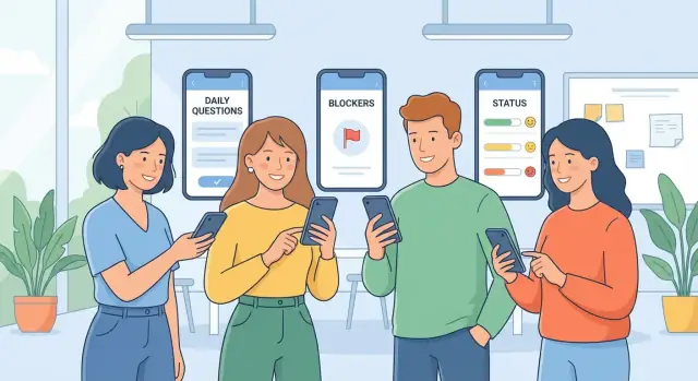
For a small team, the best standup app feels less like “another tool” and more like a faster habit. The goal is simple: everyone can post a quick update, everyone can skim it in under a minute, and blockers don’t get buried.
Start with the classic three questions (“What did you do?”, “What will you do?”, “Any blockers?”), but allow teams to tweak them without turning setup into a project.
A practical approach is to offer:
Consistency is what makes async standups scannable—templates do the heavy lifting.
The feed should be chronological, but formatted so you can scan by person first, then details.
Helpful formatting patterns:
Avoid making people open each update to understand it. Taps should be for details, not basic comprehension.
A “blocker” field is useless if it’s just text. Treat blockers as lightweight, trackable items:
This prevents the common failure mode where blockers are mentioned repeatedly but never owned.
Small teams often span time zones, so reminders must be personal and flexible.
Include:
Keep reminders friendly and minimal—enough to prevent missed check-ins, not so frequent that they get muted.
Teams don’t need enterprise search; they need “find that update from last Tuesday” and “show me current blockers.”
Prioritize a few fast filters:
This turns the app into a reference tool, not just a daily ritual—especially when someone asks, “When did this get stuck?”
A standup app succeeds when it respects attention. The best UX reduces typing, prevents lost updates, and makes it easy to scan what matters—especially blockers.
Keep the first run focused on three actions:
Avoid asking for roles, departments, or “profile completeness” up front. Capture optional details later from settings.
Treat “post my update” as the primary action.
Design a single-screen flow with the day’s prompts visible immediately (for example: “Yesterday / Today / Blockers”). Make entry fast with:
If you support voice input, keep it optional and unobtrusive.
Most people want a digest view: one card per teammate with a clear status, then drill into a full feed when needed. Prioritize:
Build in basics early: readable typography, sufficient contrast, and large tap targets for thumbs. Keep the UI quiet—avoid visual clutter and reduce badge counts.
For notifications, prefer one reminder per standup window plus an optional nudge for unread mentions. Let users tune this in settings (/settings/notifications) so the app stays helpful without becoming noisy.
A clean data model keeps your standup app easy to build, easy to evolve, and easy to report on. You don’t need dozens of tables—just the right few, with clear relationships.
At minimum, plan for these:
2025-12-26), created_at, submitted_at, and status (draft/submitted).Store timestamps (created/updated/submitted), a time zone reference (user or team), and simple tags (e.g., “release”, “support”) for filtering.
Decide early: do you need edit history or just an “edited” flag? For most small teams, an edited flag + updated_at is enough.
Use soft delete for entries/comments (hide from UI, keep for audit/reporting). Hard delete is risky once teams rely on history.
Design for:
These reports are much easier when entries have a clear (team, user, date) key and prompt answers are structured, not free-form blobs.
A standup app succeeds on reliability and speed, not on a complicated architecture. Pick tools that let you ship quickly, keep maintenance low, and avoid rebuilding the same feature twice.
For most small teams, cross-platform is the sweet spot:
Go native iOS/Android only if you already have those skills in-house or you need deep platform features from day one.
You have two practical paths:
If you want to move even faster—especially for an MVP you plan to iterate on daily—tools like Koder.ai can help you prototype the web/admin surface and backend workflow from a chat-driven spec. It’s a vibe-coding platform that can generate a React front end with a Go + PostgreSQL backend (and Flutter for mobile), plus features like snapshots/rollback and source-code export so you can keep control as the product grows.
Keep sign-in friction low:
Use an online-first approach with a small local cache so the app feels instant. For conflicts, prefer simple rules (for example: “latest edit wins,” or disallow editing after submission). Fewer edge cases beats “perfect” collaboration.
Choose the simplest stack your team can confidently support for 6–12 months. Flexibility is expensive; consistency and maintainability ship features faster.
A small-team standup app lives or dies by how quickly updates move from “someone checked in” to “everyone can read it.” The backend doesn’t need to be complex, but it should be predictable: accept entries, return feeds fast, and trigger notifications reliably.
A typical cycle looks like this: the app fetches today’s prompt set, the user submits their answers, the backend stores the entry, and teammates see it in a team feed. If you support comments or mentions, those events can trigger follow-up alerts.
Keep endpoints simple and resource-based:
For listing entries, include pagination (limit + cursor) from day one. A feed that’s fast at 50 entries should still be fast at 5,000.
Live updates are nice, not required. For an MVP, polling (e.g., refresh every 30–60 seconds on the feed screen) often feels “real-time enough” and is easier to ship. You can add WebSockets later if teams demand instant updates.
Focus on three types:
Store all timestamps in UTC and render in the user’s local time. This avoids confusion when teams span time zones or when daylight saving changes.
Add basic rate limiting to protect your API (especially for create entry and list entries). Combined with pagination, it prevents slow feeds and keeps costs under control as usage grows.
A standup app contains work updates that often include blockers, customer names, or internal timelines. Treat it like a private workspace by default, with clear rules about who can see what.
Start with a simple access model: users belong to one or more teams, and only team members can view that team’s updates. Avoid “anyone with the link” access for standups.
Make visibility obvious in the UI:
Encrypt data in transit using HTTPS for all API traffic (and for any web admin panel).
On the backend, add sensible validation so you don’t store unsafe or malformed data:
If you store push notification tokens, treat them as sensitive identifiers and rotate/revoke them on logout.
Most abuse starts at invites. Keep it boring and controlled:
For content spam, basic rate limits on posting (e.g., X entries per minute) are usually enough for small teams.
Default to no public teams and no searchable directory. New teams should be private unless an admin explicitly changes settings.
Decide early how deletion works:
Document these choices in a simple in-app policy screen (linkable at /privacy) so expectations are clear.
Small teams will forgive a simple UI faster than they’ll forgive a standup app that “eats” updates. Reliability is a feature—especially when people are commuting, traveling, or on shaky Wi‑Fi.
Let users draft their update without a connection. Store the draft locally (including selected team, date, and answers), and show a clear “Pending sync” state.
When the device reconnects, sync automatically in the background. If sync fails, keep the draft and provide a single, obvious retry action rather than forcing users to retype.
Retries happen—users tap twice, networks flap, requests time out. Make “create entry” idempotent:
This avoids double-posts and keeps the feed trustworthy.
Real teams miss days. Design for it:
Add crash reporting early and surface human error messages (“We couldn’t sync—your update is saved.”). For speed, optimize the first minute of use:
If you want a quick next step, tie these behaviors into your release checklist in /blog/launch-plan.
Standups feel “simple,” but small bugs quickly turn into daily frustration: missed reminders, duplicated posts, or yesterday’s update showing up under today. A good QA plan focuses on the workflows people repeat every morning.
Unit tests should cover the logic that’s easy to overlook and hard to spot manually:
These tests pay off whenever you change prompts, add new fields, or adjust the “today” cutoff.
Integration tests catch issues that only appear when multiple parts interact:
If you use a staging environment, run these against a real backend and a sandbox push provider so you can verify the full path end-to-end.
Use a short checklist for every release so you don’t miss the basics:
Test across a few representative devices and settings:
Roll out in two steps:
The goal isn’t perfection—it’s proving that daily check-ins stay reliable under real usage.
A good launch is less about a big splash and more about a smooth first week for real teams. Treat your first release as a learning phase with a clear rollout plan and tight feedback loops.
Start with 3–10 small teams that match your target (remote, hybrid, different time zones). Tell them exactly what you’re testing: “Can everyone complete a standup in under 60 seconds?” and “Do reminders reduce missed check-ins?”
Add lightweight in-app help for the very first standup: quick tips, an example answer for each prompt, and a short “what happens next” note (e.g., where summaries appear). These reduce early confusion without forcing users to read docs.
Before public release, prepare store basics:
Include a simple “Send feedback” entry point in Settings and after submitting a standup. Offer two paths: “Report a bug” (attach logs/screenshots) and “Suggest an improvement” (free-text). Route both into a shared inbox and acknowledge within 1–2 business days.
For small teams, keep pricing easy to understand: a free tier (limited history or team size) or a time-based trial. If you need a dedicated page, link to /pricing.
If you’re building in public, it can also help to reward early adopters and creators. For example, Koder.ai runs an earn-credits program for content and referrals—an approach you can adapt for your own standup app to encourage feedback, case studies, and team invites without relying on heavy paid acquisition.
Rollout plan: announce to beta teams, set expectations for changes, then invite the next cohort. Measure adoption with basics—activation (first standup), weekly active teams, and reminder-to-check-in conversion.
Shipping your first version is only the start. A standup app succeeds when it builds a habit—so your analytics should focus on consistency and clarity, not vanity metrics.
Instrument a small set of product events that map to the check-in flow:
Keep event properties simple: team ID, prompt ID, timezone, notification source (push/in-app), and app version.
Turn events into a few actionable metrics:
Look for drop-offs during onboarding and after the first post:
Use insights to choose improvements that increase consistency and clarity:
Avoid feature bloat: if a feature doesn’t improve posting frequency, readability, or blocker follow-through, keep it off the roadmap for now.
A standup app should reduce the reasons teams skip standups: missed check-ins, time zone mismatch, meeting fatigue, and updates getting lost in chat.
A good test is: can a teammate understand what changed and what’s blocked in under a minute?
Aim at small teams (3–20 people) with lightweight processes.
Optimize for the daily contributor first (fast posting). Leads and managers benefit automatically when participation is easy and the feed is scannable.
Async works best for distributed teams and flexible schedules.
If you support synchronous, keep it minimal (a “send by” time + reminders). A hybrid approach can be optional: async by default, with a live handoff only when needed.
Keep it linear:
If a feature doesn’t make posting or reading faster, it’s probably not MVP.
Start with just:
Add read-only observers later if it slows down onboarding or permissions.
Make check-ins finishable in under a minute:
Optional fields should never block submitting.
Use templates to keep answers consistent and scannable:
Consistency makes the feed readable without extra effort.
Treat blockers as items that drive follow-through:
This prevents “same blocker every day” with no accountability.
Support per-user time zones and configurable reminder times.
Include a light set of controls:
The goal is fewer missed updates, not more notifications.
Track outcomes that map to the habit:
Instrument simple events like prompt shown, entry started, entry posted, and reminder opened to find friction quickly.