Dec 14, 2025·8 min
How to Build a Mobile App for Personal Retrospectives
Learn how to plan, design, and build a mobile app for personal retrospectives—from prompts and UX to data, privacy, MVP scope, testing, and launch.
Clarify the Goal and Who the App Is For
Before you sketch screens or pick features, decide what “personal retrospective” means inside your product. Retros can be a five-minute daily check-in, a structured weekly review, or a post‑project debrief after a big milestone. Your app should support a specific rhythm rather than trying to fit every style at once.
Define the retrospective cadence and format
Write a one-sentence definition you can show to a user:
- Daily: quick mood + “what worked / what didn’t / what I’ll try tomorrow”
- Weekly: deeper reflection on goals, time, energy, and priorities
- Project-based: lessons learned, wins, mistakes, next steps
Pick one primary mode for version one, even if you eventually add others.
Choose a clear target user
A reflection journaling app “for everyone” often ends up feeling generic. Narrow the audience so your copy, prompts, and tone feel like they were made for someone.
Examples of target users:
- Solo professionals: want better decisions, fewer repeated mistakes, clearer priorities
- Students: want progress tracking, stress reduction, study habits that improve
- Founders/creators: want pattern recognition, momentum, and better post‑launch learning
- Hobbyists: want motivation, skill growth, and satisfaction over time
Identify the outcomes people actually want
Most users don’t want “a personal retrospective app”—they want results. List the top outcomes in plain language:
- Clarity: “I know what to focus on next.”
- Patterns: “I can see what triggers good/bad weeks.”
- Better decisions: “I choose based on evidence, not mood.”
- Less stress: “I’ve offloaded thoughts and closed loops.”
Set measurable success metrics
Define what success looks like so you can tell if your first release is working:
- Retention: do people come back next week?
- Completed retros per user: how often do sessions finish?
- Streaks (carefully): do people build a sustainable habit?
- Time-to-first-value: how quickly a new user completes their first reflection
Decide what “good” means for v1
For your first release, “good” is usually: users can start quickly, complete a meaningful retrospective in one sitting, and feel compelled to return. If your app delivers that consistently for one specific audience and cadence, you have a solid foundation to expand.
Pick a Use Case and Define Your MVP Scope
A personal retrospective app can easily turn into “a journal, plus goals, plus mood tracking, plus analytics…” and never ship. The fastest way to build something people will actually use is to commit to one clear situation where your app is genuinely helpful.
Choose the primary use case
Pick the moment your user most needs structure. Common starting points:
- Weekly review: reflect on wins, challenges, and next week’s focus
- End-of-day recap: a quick reset before bed
- Post-project review: capture learnings after a milestone
Choose one, based on the simplest promise you can make. For example: “Finish a weekly retro in 5 minutes and leave with one concrete next step.”
Pick 1–2 signature workflows
Your mobile app MVP should have a small number of “signature” flows that feel polished.
A strong pair is:
- Guided prompts (a structured, step-by-step retrospective)
- A short summary at the end (what went well, what to improve, one action)
Avoid building five different modes. One excellent flow used consistently beats many half-finished ones.
Define must-have vs. nice-to-have
A practical MVP checklist for a reflection journaling app is:
- Must-have: create a retro, answer prompts, save it, view past entries
- Nice-to-have: tags, charts, streaks, exports, integrations, AI summaries
If a feature doesn’t directly support finishing the retro quickly and saving the result, it probably isn’t MVP.
Write a simple user story list
Keep your user stories measurable and time-bound. Examples:
- “I can complete a weekly retro in under 5 minutes.”
- “I can resume an unfinished retro without losing my answers.”
- “I can reread last month’s retrospectives in a few taps.”
These become your acceptance criteria and prevent scope creep.
Decide platforms early
If you’re a small team, start with one platform unless there’s a strong reason not to. Pick based on where your audience already is, your team’s experience, and your desired timeline.
If you must support both iOS and Android, keep the first release even narrower so you can deliver the same core experience reliably on both.
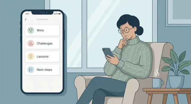
Design Retrospective Templates and Prompts
Great retrospectives feel easy to start and satisfying to finish. Your templates and prompts are the “engine” of that experience, so keep them simple, repeatable, and flexible.
Start with 2–3 templates people instantly recognize
Begin with a small set that covers most reflection styles:
- Wins / Challenges / Lessons / Next steps: a balanced weekly review that naturally leads to action
- Start / Stop / Continue: practical for habits, work routines, and personal experiments
- Mood + highlights: lightweight daily check-in that still creates meaningful history
Each template should fit on one screen without feeling cramped. Aim for 4–6 prompts per session so users finish before they get tired.
Mix prompt types to reduce typing fatigue
Use different input types based on what you need to learn:
- Text for stories and nuance (“What surprised you this week?”)
- Multiple choice for quick pattern tracking (“Energy level: low/medium/high”)
- Rating scales for trends (“Stress: 1–5”)
- Tags for later search and insights (“work”, “health”, “relationships”)
Make every prompt optional unless it’s essential to the template. Skipping should never feel like failure.
Add optional context fields (without turning it into admin work)
Context helps people understand their past self. Offer optional fields such as week number, project, people, and location—but keep them tucked behind “Add details” so the core flow stays fast.
Customization: power, not overwhelm
Let users personalize prompts in small steps:
- Start with “Edit this template” and allow rename, reorder, hide.
- Offer a few “Add a prompt” suggestions rather than a blank slate.
- Provide a safe default with a “Reset to original” option.
Keep the tone supportive and neutral
Use clear, non-judgmental language: “What felt hard?” instead of “What did you do wrong?” Avoid therapy or medical claims; position the app as a reflection and planning tool, not treatment.
Map the Core User Flow and UX
A personal retrospective app succeeds when it feels effortless to start and satisfying to finish. Before polishing visuals, map the path a user takes from “I want to reflect” to “I feel done.” Keep the number of decisions low, especially in the first minute.
Sketch the smallest set of screens
Start with the minimum screens that support a complete loop:
- Home: one clear primary action (Start a retro) plus quick access to recent entries
- New Retro: pick a template (or last-used) and optionally set a timeframe
- Prompt flow: one prompt per screen, with simple navigation
- Summary: a readable recap with edits before saving
- History: past retros with search and filters
This structure works well for a prompt-based journaling experience because it separates “doing” from “browsing,” reducing clutter when users are writing.
Design for quick entry (minimal typing)
Retrospectives should be doable in 3–7 minutes. Make input lightweight:
- Provide tap-first options (mood chips, common wins, blockers) with the ability to add a custom note
- Offer auto-suggestions for recent tags and recurring topics
- Remember the last-used template and default timeframe
Minimal typing helps your mobile app MVP feel usable even when someone is tired or on the go.
Create momentum with progress and a “finish” moment
Use a subtle progress indicator (e.g., “2 of 6”) so users know the effort is bounded. Then make completion explicit: a final “Finish & Save” step, a calm confirmation, and an optional next action (set a reminder, add a tag). That clear ending is what turns prompt-based journaling into a repeatable habit.
Accessibility and focus
Support basics from day one: adjustable font size, strong contrast, and screen reader labels for prompts, buttons, and fields. Keep each screen focused on the current step—avoid showing history, insights, and settings while the user is mid‑retro.
Build Reflection History, Search, and Insights
Go cross platform
Build once for iOS and Android while keeping the first release focused and simple.
A retrospective app only becomes valuable when people can return to what they wrote and notice patterns over time. Treat history as a first-class feature, not an afterthought.
Make past reflections easy to browse
Different people remember time differently, so give at least two ways to navigate:
- Timeline for quick scrolling through entries
- Calendar view for “what was happening last week/month?” moments
Add tags (user-created, not forced) and optional filters like template type (weekly, project, mood check-in) so history doesn’t turn into a long, shapeless feed.
Search that feels forgiving
Search should work even when users don’t remember exact wording. Start simple:
- Full-text search across titles and answers
- Tag search and multi-tag filters
- “Jump to date” or “Last time I wrote about…” shortcuts
A small touch that helps a lot: highlight matched terms inside an entry preview so users know they found the right one.
Lightweight insights that don’t get preachy
Insights should support reflection, not grade it. Keep them optional and easy to interpret:
- Streaks (with a “no guilt” reset message)
- Common tags (top themes this month)
- Mood trend, only if you explicitly collect mood data and explain how it’s used
Summaries and “Next steps” that remain user-owned
Decide how summaries work:
- User-written (best for trust and accuracy)
- Prompt-based recap (e.g., “One win, one lesson, one change”) generated from their answers
- Optional AI summary only if available—and only with clear control and opt-in
Add a dedicated Next steps list that can be pinned to the home screen and revisited later. Make it easy to mark items done, defer them, or turn them into future prompts.
Exporting builds trust
Let users take their data with them: export as PDF for sharing, Markdown for personal notes, and CSV for analysis. A good export feature quietly signals: “This is yours.”
Plan Data, Accounts, and Sync Early
A personal retrospective app feels simple on the surface—answer a few prompts, save, revisit later. But early decisions about accounts and storage will shape everything from onboarding to trust. Make these choices before you design too many screens, so you don’t have to rebuild later.
Decide what “sign-in” really needs to be
Start by picking one of these models and sticking to it for your MVP:
- No account: fastest start and best for privacy-minded users. Data lives on the device.
- Optional account: users can begin instantly, then enable sync later.
- Email sign-in: works everywhere, but adds friction (password resets, verification).
- Apple/Google sign-in: low friction, but adds platform dependencies.
For a reflection journaling app, “optional account” is often a sweet spot: users can try it without committing, then opt into syncing when they trust you.
Choose storage: on-device, cloud, or hybrid
Be explicit about where entries live:
- On-device only: simplest and private, but users can lose data if they lose the phone.
- Cloud sync: best continuity across devices, but increases security and compliance work.
- Hybrid: store locally first, then sync in the background when signed in.
If you’re building an offline-first mobile app, hybrid storage is a natural fit: the app works without internet, and syncing becomes an enhancement—not a requirement.
Outline a data model you won’t regret
Keep the first version small and readable. A simple model might include:
- Retro: date, template used, mood/score (optional), notes
- PromptAnswer: prompt text (or ID), response, order
- Tag: user-defined topics like “work,” “health,” “relationships”
- Attachment: optional photos, voice notes, or files (if you truly need them)
- Reminder: schedule, preferred time, snooze rules, enabled/disabled
Design so a retro can be exported and understood even years later.
Plan backup, restore, and deletion
If you store on-device, make backup/restore a first-class feature (export to file, device backup support, or a guided restore flow). Whatever you choose, keep data ownership clear: users should be able to delete entries (and their account, if applicable) from within the app, with plain-language confirmation of what will be removed.
Prioritize Privacy and Security from the Start
A personal retrospective app is closer to a diary than a typical productivity tool. People will write things they wouldn’t share elsewhere—about their mood, relationships, health, work conflicts, money worries, or personal goals. If users don’t feel safe, they won’t be honest, and the app won’t work.
Minimize what you collect (and what you store)
Start by listing the kinds of sensitive data your app might touch: mood ratings, free‑text reflections, names of people, work notes, location hints, photos, or “private tags” like anxiety, burnout, or conflict.
Then make a deliberate choice to collect less:
- Don’t ask for profile data you don’t truly need.
- Avoid uploading entries to a server unless you have a clear benefit (sync, backup, multi-device).
- If you do analytics, keep it high-level (feature usage), not content-level (what users write).
Lock the app (optional, not forced)
For many audiences, a passcode or biometric lock is a trust signal. Make it optional and easy to find in settings, with sensible behavior:
- Support Face ID/Touch ID (or Android biometrics) when available.
- Use a fallback passcode.
- Be clear about what happens if someone forgets the passcode (especially if data is only on-device).
Encrypt data at rest and in transit
If you keep data on-device, use the platform’s secure storage patterns for keys and encrypt the local database when appropriate.
If you use a backend for sync:
- Encrypt data in transit (HTTPS/TLS).
- Encrypt sensitive data at rest on the server.
- Treat backups as sensitive too.
Explain privacy in plain language
Users shouldn’t need a law degree to understand your approach. In onboarding and settings, summarize:
- What you store on the device vs. in the cloud
- What you collect for diagnostics/analytics
- What you never read (your users’ entry content)
Make deletion simple and complete
Offer a clear path for:
- Deleting a single entry
- Deleting all local data
- Deleting the account (if you have accounts), including synced copies
State what “delete” means and how long it takes, so users can trust you when they need a clean exit.
Choose Your Tech Stack (Without Overthinking It)
Own the codebase
Keep full ownership with source code export so you can extend the app anytime.
Your first version should be easy to build, easy to change, and reliable when someone opens it on a tired Sunday night. That usually matters more than picking the “perfect” framework.
Native vs. cross-platform
If you’re building solo or with a small team, cross-platform is often the fastest path to a quality app.
- Native (Swift for iOS, Kotlin for Android): best platform fit and long-term control, but you’re effectively building two apps.
- Cross-platform (React Native or Flutter): one codebase, faster iteration, and plenty of UI flexibility for journaling-style screens.
For a personal retrospective app, performance demands are modest. Choose the option your team can ship with confidently.
Do you need a backend on day one?
Not always. Many MVPs can start fully on-device. Add a backend only if you truly need:
- Sync across devices (phone + tablet)
- Account login
- Payments/subscriptions
- Analytics beyond basic, privacy-friendly events
If you don’t need those immediately, skip the backend and focus on the core experience: creating retrospectives and reviewing them.
Database strategy: local first, cloud optional
Plan a local database as the source of truth. This supports fast loading, search, and offline access. Then treat cloud sync as an optional layer you can add later.
A practical model is: local database → background sync when signed in → conflict handling kept simple (for example, “latest edit wins” for MVP).
Build faster without sacrificing control
If your goal is to get a mobile app MVP into testers’ hands quickly, a vibe-coding workflow can help you move from spec → screens → working flows without weeks of scaffolding.
For example, Koder.ai lets you build mobile apps via chat (including Flutter for cross-platform) and can generate the supporting backend pieces when you decide you need them (often Go + PostgreSQL). It also supports planning mode, snapshots and rollback, and source code export—useful if you want speed early but still want the option to own and evolve the codebase later.
Keep dependencies minimal
Every library is future maintenance. Prefer built-in platform features and a small set of well-supported packages. Fewer moving parts makes your app more stable—and lets you spend time on prompts, templates, and insights instead of toolchain issues.
Add Reminders and Motivation Features Responsibly
Reminders can turn a personal retrospective app from “nice idea” into a steady habit—but they can also become noise, pressure, or guilt. Treat motivation features as user-controlled tools, not behavior enforcement.
Design reminder types that match real life
Offer a few clear options rather than an overwhelming scheduler:
- Daily nudge for lightweight check-ins (1–3 minutes)
- Weekly review for deeper reflection (10–20 minutes)
- Custom schedule for people who reflect after specific routines (Sunday evening, after workouts, end of workday)
Keep defaults conservative. One good weekly reminder is better than five ignored daily pings.
Give users full control (and quick exits)
Let users pick time, days, and frequency, and make it easy to adjust later. Add two “escape hatches” directly in the reminder experience:
- Snooze (e.g., 30 minutes, 2 hours, tomorrow)
- Skip (skip once, skip this week)
This prevents the common problem where users disable notifications entirely because they felt trapped.
Write gentle, respectful copy
Your tone matters as much as timing. Avoid guilt-driven messages (“You missed yesterday”). Instead, use neutral, inviting language:
- “Want to capture a quick win from today?”
- “Ready for a 5-minute check-in?”
- “Weekly review is here when you are.”
Also avoid implying surveillance. Reminders should feel like a calendar note, not an app judging performance.
Make streaks and goals optional
Streaks can motivate some users and discourage others. If you include them, make them opt-in, easy to hide, and forgiving (e.g., “best streak” and “reflections this month” over “perfect daily chain”). Consider alternative progress signals: minutes reflected, number of themes discovered, or “weeks with one review.”
Add a “reflection ritual” onboarding
During onboarding, help users set expectations: choose a preferred time, select a template, and define what “success” means (daily micro-notes vs. weekly reviews). Frame it as a personal ritual they control—your app simply supports it.
Test the App with Real Users and Real Scenarios
Grow into cloud sync
When you need sync and accounts, add a Go plus PostgreSQL backend without starting over.
Testing a personal retrospective app isn’t just about finding crashes. It’s about confirming that someone can start a reflection, finish it without friction, and feel confident they can return later and learn from it.
Write a simple test plan for the core flow
Start with the “happy path” you’re building the whole product around:
- Start a retro (pick a template, answer prompts)
- Finish and save
- Review history (find the entry, re-read it, spot patterns)
Run this flow on multiple devices and screen sizes. Time it. If the flow feels long or confusing, it will feel even worse to a first-time user.
Test the awkward edge cases on purpose
Reflection apps have messy inputs. Make sure your app behaves calmly when users do things that are totally normal:
- Submitting with empty answers (or skipping a prompt)
- Writing very long text (scrolling, performance, save reliability)
- Switching timezones or changing the system date/time
- Missing reminders, then returning days later
- Closing the app mid-entry and reopening (draft recovery)
Run small usability tests (5–10 people)
Use a clickable prototype or a test build and give each person a short scenario: “You had a stressful week—do a quick retro and find it tomorrow.” Watch where they hesitate. Don’t explain the UI while they’re using it; note what they expect to happen.
Track bugs and fix what blocks completion
Log issues with clear steps to reproduce and a screenshot when possible. Prioritize anything that prevents finishing a retro, saving it, or finding it later. Cosmetic issues can wait.
Prepare for App Store and Play Store review
Before submitting, double-check common review blockers: permission prompts match actual features, privacy disclosures are accurate, and any required privacy policy placement is correct. Also confirm that notifications are optional and explained in plain language.
Launch, Measure, and Improve the First Version
Shipping version 1 is less about being “done” and more about creating a clear promise: this app helps someone reflect in a few minutes and feel progress over time. Your launch materials should communicate that promise quickly, then your measurements should tell you whether people are actually getting it.
Write store listing copy that lands the value fast
Aim for a one-sentence benefit that matches how users talk about their problem. For example: “A guided reflection journal that helps you spot patterns and make better weekly decisions.”
Keep the rest of the description focused on outcomes (clarity, consistency, insight) and the simplest flow: choose a template → answer prompts → see a summary. Avoid listing every feature; highlight the reason to return.
Screenshots: show the prompt flow and the payoff
Many people decide from screenshots alone. Include:
- A screen that shows the first prompt (so it feels approachable)
- One or two screens that show the flow (progress indicator, short answers)
- A summary/history screen that shows what they gain (themes, streaks, highlights)
Your goal is to make the experience obvious in five seconds.
Monetization: pick one simple model
Choose a model that doesn’t punish reflection. Common options:
- Free + premium templates (best when templates are your differentiator)
- Subscription (best when you’ll keep adding insights and improvements)
- One-time purchase (best when the app is complete and low-maintenance)
Whatever you choose, keep the free experience genuinely useful so users can build trust.
Analytics that respect privacy
Track only what helps you improve the experience. Basic events like “template selected,” “retro started,” “retro completed,” and “insights viewed” are usually enough. Avoid capturing raw text responses; measure behavior, not personal content.
Plan the first 4–6 weeks of improvements
Before launch, decide how you’ll turn feedback into action. In the first month, focus on:
- Fixing friction that blocks completion (slow typing, confusing prompts, too many steps)
- Improving retention (better reminder settings, quicker resume, more flexible templates)
- Clarifying what the history/insights mean (simple tags, better summaries)
Treat version 1 as a learning tool: ship, observe, adjust, and keep the core reflection habit feeling lightweight and rewarding.
FAQ
Should my app support daily, weekly, and project retrospectives from day one?
Start by choosing one primary rhythm for v1—daily, weekly, or project-based—and write a one-sentence promise (e.g., “Finish a weekly retro in 5 minutes and leave with one next step”). Designing for a specific cadence keeps templates, reminders, and analytics focused.
How do I choose a target user for a personal retrospective app?
Pick a clear audience with a shared context (e.g., solo professionals, students, founders). Then tailor:
- prompt wording and tone
- default templates
- example tags and outcomes
A narrower target user usually increases activation and retention because the app feels “made for me.”
What belongs in the MVP for a reflection/retrospective app?
Use a must-have list tied to finishing a retro:
- create a retrospective
- answer prompts
- save it
- view past entries
Anything that doesn’t directly support quick completion (charts, streaks, integrations, AI summaries) is typically nice-to-have for later.
How many core workflows should I build for version 1?
Ship 1–2 signature workflows that feel polished, such as:
- a guided prompt flow (step-by-step)
- an end summary (win, lesson, one action)
A small number of excellent flows used repeatedly beats many half-finished modes.
How do I design templates and prompts that users will actually finish?
Start with 2–3 familiar templates and keep each session to 4–6 prompts so users don’t fatigue. Good starters:
- Wins / Challenges / Lessons / Next steps
- Start / Stop / Continue
- Mood + highlights
Make prompts optional unless they’re essential to the template.
How can I minimize typing and friction in the prompt flow?
Reduce typing by mixing input types:
- multiple choice (quick patterns)
- rating scales (trends)
- tags (later retrieval)
- short text (nuance)
Also remember last-used template/timeframe and provide tap-first suggestions with an “add note” escape hatch.
What’s the best way to build history, browsing, and search?
Treat history as a first-class feature:
- provide a timeline and/or calendar view
- add user-created tags and filters (template type, timeframe)
- implement full-text search and highlight matched terms in previews
The goal is “I can find what I wrote” in a few taps, even months later.
What kinds of insights work without feeling preachy or invasive?
Keep insights optional and non-judgmental:
- common tags/themes
- mood trends (only if you collect mood explicitly)
- streaks with “no guilt” messaging or the ability to hide them
If you add AI summaries, make them opt-in, controllable, and never required to complete a retro.
Do I need accounts and cloud sync in the first release?
Common MVP-friendly options:
- No account: fastest and private, but risky if the device is lost
- Optional account: start instantly, enable sync later
- Hybrid storage: local-first database + background sync when signed in
Design your data model so entries remain understandable when exported years later.
What privacy and security features matter most for a retrospective app?
Focus on trust basics:
- collect as little personal data as possible
- offer optional app lock (biometrics/passcode)
- encrypt data in transit (TLS) and at rest (device/server as applicable)
- provide simple deletion (single entry, all data, account deletion)
Also avoid content-level analytics; track behavior events like “retro completed,” not what users wrote.