Jan 02, 2026·7 min
3-Screen Starter App Template for Beginners to Build Faster
Use the 3-screen starter app template to build your first app faster: start with a list, an add form, and a simple settings page you can grow later.
Use the 3-screen starter app template to build your first app faster: start with a list, an add form, and a simple settings page you can grow later.
Beginners often freeze because they picture the finished product first. That brings a pile of screens, features, and decisions before anything even works. When you can’t run the app end to end, motivation drops and it’s hard to tell what to build next.
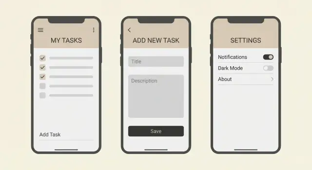
A three-screen starter template keeps the scope small while still feeling like a real app. A List screen gives you something to look at, an Add screen lets you change the data, and a Settings screen gives you a place for simple preferences. Together they create a complete loop: see data, add data, change a basic option, and see the result.
Three screens also force you to practice what shows up in almost every app, without drowning in details.
You get quick practice on the skills that transfer to bigger projects:
Because the template is small, you can finish it in a weekend and still have time to polish. A simple book tracker, for example, can start as a list of books, a form to add a title and author, and a settings page to choose how the list is sorted.
This template stays small but covers the basics: showing data, creating data, and saving preferences.
The List screen answers one question: what do I have right now? It shows your items in a clean, readable way.
Don’t skip the empty state. When there are no items yet, show a short message and one clear action like “Add your first item.” That prevents the blank-screen moment that confuses people.
Keep sorting simple at first. Pick one rule (newest first, or alphabetical) and stick to it. If you add options later, make it a small control, not a whole new screen.
The Add screen is where most beginner bugs happen, so keep it intentionally boring. Use only the fields you truly need. For a tiny task list, that might be a title and an optional note.
Validation should be friendly and specific. If a required field is empty, show a short message near that field. After saving, the result should be obvious: the item appears on the List and the form resets (or the screen closes).
Settings should be small and real. Add a couple of toggles and one simple text preference so you practice saving and loading user choices. Examples include a Dark mode toggle, a “Confirm before delete” toggle, and a text field like “Display name.”
Here’s the basic flow:
Pick one “thing” your app manages. Not five things. One. Tasks, contacts, receipts, notes, workouts, plants, or books all work because they fit the same loop: you see items, you add an item, and you adjust a couple of preferences.
A good tiny idea fits in one breath: “This app helps me track ___.” If you need extra sentences to explain tags, recommendations, syncing, and sharing, it’s not tiny anymore.
Define your data before you touch the UI. Write down 3 to 6 fields for your “thing,” and mark which ones are required. A receipt item might look like: store (required), total (required), date (required), category (optional), note (optional). Keeping it short forces tradeoffs, and tradeoffs are what make a v1 finishable.
Be strict about what “done” means for v1. Done should mean you can add an item, see it in a list, and the settings change something small but real. Not search, not accounts, not sharing.
One practical way to lock scope is to write one sentence per screen:
Example: “A workouts app.” List: shows workouts with date and duration. Add: adds a workout with date, duration, and optional notes. Settings: chooses minutes vs hours display and a default workout type. If you can’t write these three sentences without sneaking in extra features, shrink the idea until you can.
A beginner-friendly app goes faster when the data model is boring. The goal isn’t a perfect database. It’s predictable behavior so every next feature feels like a small step, not a rewrite.
Start with a single source of truth for your items: one place where the list lives (one array in app state, or one table on the server). Avoid copying the list into multiple screens or keeping a “temporary list” that slowly becomes the real one. Copies create weird bugs like “it saved, but it didn’t update.”
Keep the item shape consistent across List, Add, and Settings. Pick names, types, and defaults, then stick to them. A simple item can be:
id (string)title (string)createdAt (date or timestamp)done (boolean, default false)notes (string, default empty)If you add fields later, add them everywhere with sensible defaults. A common beginner mistake is using name on one screen and title on another, or treating done as both a boolean and a string like "yes".
Plan a few basic states so the app doesn’t feel fragile:
Keep these states concrete. If the list is empty, show one short sentence and a button that opens the Add screen. If saving fails, keep the form filled in and show a plain message like “Couldn’t save. Try again.”
Finally, decide local vs server storage with a simple rule: store locally if the app is useful on one device and doesn’t need sharing; use a server if you need sync, login, or access from multiple devices. For many starter projects, local storage is enough. If you later move to a backend (for example, a Go + PostgreSQL setup), keep the item shape the same so the UI barely changes.
Build in a strict order. Each step should leave the app usable, even if it’s still “fake” behind the scenes. That’s the point of the three-screen template: you always have something you can tap through.
Create the List screen and hardcode 5 to 10 sample items. Give each item just enough fields to display well (for example: title, a short note, and a status).
Add the empty state early. You can trigger it with a simple toggle or by starting with an empty array. Show a friendly message and one clear action like “Add item.”
If you want one small control on the list, keep it tiny. A simple search box that filters by title is enough. Or add a single filter like “Active only.” Don’t turn it into a whole system.
Build the form UI with the same fields your list needs. Don’t wire saving yet. Focus on input layout, labels, and one clear primary button.
Then add validation with messages that tell the user exactly what to fix:
Now wire Save so the new item appears in the list. Start with in-memory state (it resets on restart), then move to storage or a backend later. The first win is seeing the new item show up immediately.
Keep settings small and make each one change something you can see. A “Compact view” toggle can change list spacing. A “Show completed” toggle can change which items appear. If the setting doesn’t change anything, it doesn’t belong yet.
A beginner app starts feeling “real” when the screens answer small questions without extra taps. These touches don’t add much work, but they remove friction.
Add one or two bits of context near the top, like an item count and a simple “Updated just now” line after changes. If your items have a state, show it as a short tag like “Open” or “Done” so people can scan.
A useful rule: if the user can ask “How many?” or “Is this current?”, answer it on the list screen.
The Add screen should be faster than typing into a notes app. Use defaults so the user can submit with minimal effort. Match input types to the data: numeric keypad for quantities, date picker for dates, toggles for on/off choices.
Make the primary button unmissable, and label it clearly. “Save” works, but “Add to list” is even clearer.
Small form touches that pay off quickly:
Settings shouldn’t become a junk drawer. Keep 2 to 3 options that actually affect how the app works, like sort order, units, or a simple “Archive completed items” toggle. Each setting should have an immediate effect back on the list screen, otherwise it feels pointless.
Many beginner apps feel clunky because the keyboard covers buttons, focus jumps around, or tap targets are tiny. Fixing these early makes every test run smoother.
Quick checks:
A grocery list is a good example: a default quantity of 1, a “Bought” tag on the list, and one setting like “Group by aisle” can make it feel useful without expanding beyond three screens.
The fastest way to get stuck is expanding scope before the app works end to end. This template is meant to get you to a working loop: see a list, add an item, and adjust one or two settings that change real behavior.
The slowdowns that show up most often:
A quick example: if you’re building a tiny grocery list and add family accounts early, you’ll spend hours on login screens before anyone can add “milk.” If you skip validation, you’ll later wonder why the list is full of blank rows.
When you feel the urge to expand, do this instead:
Protect the core loop and you’ll be able to add edit, delete, and accounts later without rebuilding everything.
Before you add search, tags, accounts, or notifications, make sure the three screens you already have feel solid. If the basics are slow or confusing, every new feature multiplies the pain.
Test as if you’re a first-time user on a small screen, with one hand.
A simple script: add three items, make one mistake on purpose, change a setting, then restart the app. If any step feels uncertain, fix that before you build screen four.
A grocery list is perfect for this template because it feels real but stays simple. You’re not building a “shopping platform.” You’re saving items, adding new ones, and picking a few preferences.
Each grocery item can be one record with a few clear fields:
That’s enough to practice create and read without designing a big system.
Keep Settings small, but make each option do something you can see right away. For this app, three settings are plenty: a default store, “group items by store,” and a dark mode toggle.
A quick walkthrough you can build fast:
Create two items:
Return to the List screen. You should see both items, along with their store and quantity. If you show the created date, keep it subtle (like “Added today”).
Now open Settings and set Default store to “Costco.” Return to Add and create “Bread.” The Store field should already be filled in. That single change makes Settings feel useful.
Next, enable “Group items by store.” Return to List. Items should group under headers like “Costco” and “Whole Foods.”
Finally, toggle Dark mode. The app should switch themes immediately. If you want one extra learning moment, make dark mode persist after restarting the app.
Once your three screens work end to end, the next goal isn’t “more screens.” It’s one more useful behavior that still fits your tiny app. If you can’t explain the change in one sentence, it’s probably too big.
Add one feature at a time and finish it fully (UI, data, empty states, and a quick test). Good first upgrades include editing an item, deleting with undo, adding search (only if the list gets long), or adding simple categories.
After you ship one upgrade, pause and ask: did this make the app clearer, or just more complicated? Beginners often stack features that all touch the same data in different ways, and the app turns messy fast.
Start without a backend if the app is personal and lives on one device. Add a backend when you need sign-in, syncing across devices, sharing with another person, or reliable backups.
When you introduce a backend, keep the first version boring: save and load the same data you already have. Hold off on advanced ideas like roles or analytics until basic create, read, update, delete is stable.
As you expand, the biggest risk is breaking what already works. Work in small checkpoints: before a new feature, take a snapshot of the current working version. If the new feature goes sideways, roll back and try again with a smaller step.
If you want a chat-first way to build this template, Koder.ai (koder.ai) is designed for generating web, backend, and mobile apps from plain-language prompts, and it supports snapshots and rollback so you can iterate without losing a working version.
The main idea stays the same: grow the app through small, safe upgrades, not one big rebuild.
Start with three screens because it gives you a complete loop you can run end to end: view items, add an item, and change a preference that affects what you see. That quickly reveals what’s missing without forcing you to design the whole app upfront.
Use this when your app mostly manages one kind of thing, like tasks, books, receipts, workouts, or grocery items. If your idea needs multiple item types, complex workflows, or user roles on day one, shrink it until it can fit one list and one add form.
Pick one “thing” your app tracks and write down 3 to 6 fields with clear required vs optional. If you can’t decide, start with just an id, a title/name, and a created date; you can add one optional notes field after the loop works.
Build the List screen first with fake items so you can see the layout, empty state, and basic sorting. Then build the Add form UI and validation, and only after that wire saving so new items appear in the list; add Settings last and make every option change visible behavior.
Show a short message that explains what’s missing and provide one obvious action that opens the Add screen. A blank screen with no guidance feels broken, so treat the empty state like a real design, not an afterthought.
Keep validation close to the input and make the message specific, like “Title is required” or “Total must be a number.” Don’t wipe the form on error; keep what the user typed so fixing it takes one step, not a full re-entry.
Store your items in one place as the single source of truth, then have the list read from it and the add form write to it. Avoid copying arrays between screens because that’s where “it saved but didn’t update” bugs usually come from.
Add settings that change something you can immediately notice on the List screen, such as sort order, compact view spacing, show/hide completed items, or a default value used by the Add form. If a setting doesn’t affect behavior yet, it’s not a setting; it’s just noise.
Start with in-memory saving to prove the loop works, then add local persistence if the app is personal and single-device. Move to a backend when you need sync, sharing, sign-in, or reliable cross-device access; keep the same item shape so the UI doesn’t need a rewrite.
Take small checkpoints before big changes so you can undo quickly if something breaks. If you’re using a platform like Koder.ai, snapshots and rollback make this easy, but the habit matters even without tooling: change one thing, test the loop, then continue.